Have you ever wondered why certain color pairings just click?
This intrigue is at the heart of a concept known as Complementary Colors. Essentially, complementary colors are two hues positioned opposite each other on the color wheel, such as red and green, or blue and orange. This strategic placement creates a dynamic contrast, making each color appear more vibrant when used together, an integral part of basic color theory.
Understanding Complementary Colors isn’t just about taste; it’s a critical element of color theory. In the realms of art and design, these harmonious color combinations play a pivotal role. They not only influence the mood of a painting but also the effectiveness of a brand’s visual identity.
Whether you’re a budding artist or a seasoned designer, grasping this concept can significantly transform your approach to color, enhancing the aesthetic appeal and emotional resonance of your creative projects.
Understanding complementary colors
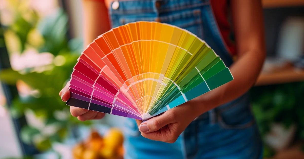
The color wheel is a fundamental tool in grasping the nuances of complementary colors. Imagine a wheel segmented with a spectrum of hues, where primary colors like red, blue, and yellow are spaced evenly. Nestled between these, you’ll discover secondary colors and tertiary hues, together forming a harmonious circle of colors.
In this colorful spectrum, complementary colors are pairs that sit directly opposite each other, a testament to their high contrast and vibrant interaction. For instance, the classic pair of red and green is a perfect example of this concept. When these two colors are placed side by side, they create a striking visual impact due to their opposite nature on the color wheel.
Take the pair of orange and blue or yellow and purple; these combinations are not only pleasing to the eye but also embody the intriguing dynamics of color theory. In the world of art and design, leveraging such pairs can infuse a vivid sense of balance and energy into a work, demonstrating the practical use of complementary colors.
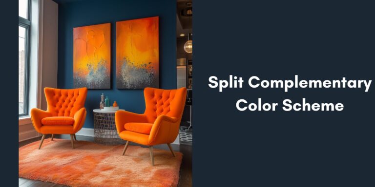
However, if you are looking for Split complementary colors where you choose one base color and then use the two colors adjacent to its complementary color on the color wheel, creating a vibrant yet balanced palette then check out our article Mastering Split complementary colors.
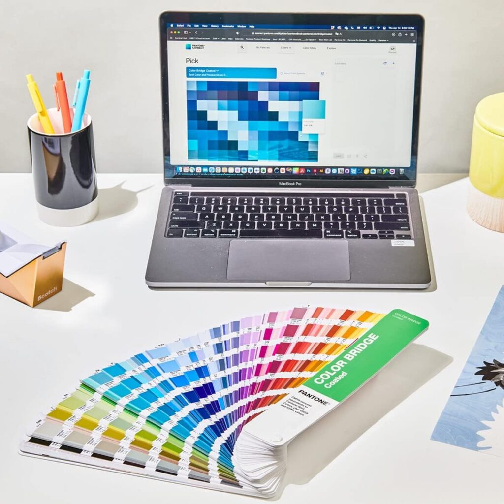
Available Here
By understanding these relationships, you’ll see how complementary color schemes can transform a design or artwork, making it visually compelling and harmonious.
Use of complementary colors in design
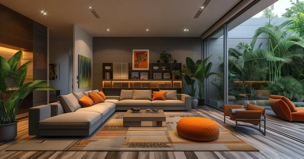
Mastering the use of complementary colors is a game-changer in design, offering a way to create striking contrast and visual appeal. The key is to select one color to dominate and its opposite to accentuate. This method ensures a visually balanced yet captivating composition. Consider, for instance, a predominantly blue website (a cool color) with vibrant orange (a warm color) call-to-action buttons. This contrast naturally draws the viewer’s eye to crucial elements.
In the sphere of branding and marketing, the strategic implementation of complementary color pairs like red and green or orange and blue can profoundly impact a brand’s perception. These colors do more than just captivate; they evoke emotions and convey powerful messages. Red and green, beyond their festive association, can symbolize vitality and growth. Choosing the right complementary color palette can become a brand’s visual hallmark, ensuring instant recognition and emotional connection.
When weaving complementary colors into your design projects, consider these tips:
- Experiment with Shades: Pair different shades of your chosen complementary colors, like a pastel blue with a deep orange, for a more nuanced contrast.
- Balance is Key: It’s not just about the colors, but their thoughtful application. Too much contrast can overwhelm, so strive for a harmonious balance.
- Context Matters: The context and message of your design are crucial. Your color choices should amplify the project’s theme, not overshadow it.
- Test Your Choices: Always preview your color combinations in the intended medium, as colors can vary between screens and print. Testing ensures the desired visual impact.
Through these techniques, complementary colors can significantly enhance the aesthetic and emotional appeal of a design, making it not only visually arresting but also resonant with its intended audience.
Impact of complementary colors on emotions

Complementary colors have a profound influence on emotions, primarily due to their high contrast and visual intensity. This contrast can evoke feelings of excitement and intrigue, making it a potent tool in visual storytelling. For example, the popular complementary pair of orange and blue can instill a sense of trust and reliability, as the warm hue of orange balances the coolness of blue.
Brands skillfully use complementary colors like red and green or yellow and purple to convey their message and evoke specific emotions. Take the bold red and green of a well-known coffee chain’s logo. This combination implies warmth, comfort, and a sense of refreshment, perfectly aligning with the brand’s identity. In the same vein, the use of yellow and purple in certain confectionery brands balances luxury (purple) with fun (yellow), appealing to a diverse audience.
These examples illustrate how complementary colors do more than capture the eye; they also connect with the heart. They play a crucial role in brand perception and emotional engagement, demonstrating the power of color in creating a lasting impact.
Through understanding and application, complementary colors can transform any design, making it not only visually appealing but also emotionally resonant.
Basic Complementary Colors

At the core of color theory lie the fundamental complementary color pairs, each a blend of one primary and one secondary color. These pairs are essential for understanding the concept of color harmony and contrast.
Exploring the world of complementary colors can be a captivating journey. Here’s a quick guide to some basic pairs and how they interact:
- Red and Green: More than just a festive pairing, these colors are used in various design contexts for their striking contrast and visual appeal.
- Blue and Orange: Reminiscent of a sunset, where warm oranges beautifully juxtapose the cool blues.
- Yellow and Purple: A blend that’s both regal and playful, often employed to evoke a sense of luxury and creativity.
- Green and Magenta: A less common duo, offering a modern and edgy visual experience.
- Cyan and Red: This vibrant and energetic combination is perfect for designs needing a bold statement.
- Orange and Blue: Ideal for achieving a balanced yet lively aesthetic, this pair is frequently seen in dynamic themes.
- Yellow and Blue: While not strictly complementary, this duo is visually pleasing and often used in designs that aim for cheerfulness and brightness.
These basic complementary pairs are the building blocks for creating captivating and harmonious color schemes in various artistic and design fields.
Color Theory: How Do Complementary Colors Work
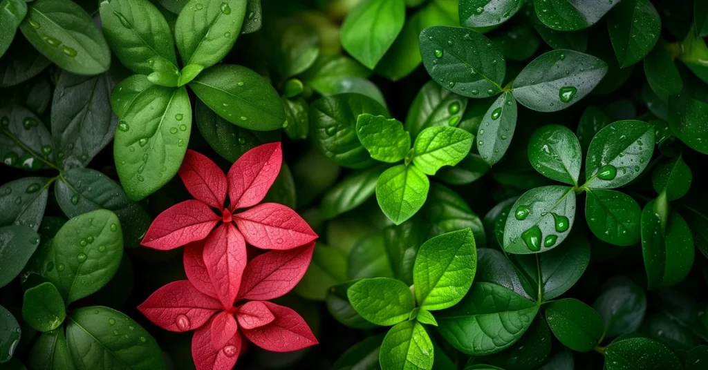
Complementary colors operate on the principles of contrast and balance, key tenets of color theory. When these colors are paired, they create a visual harmony that’s both striking and aesthetically pleasing. This happens because complementary colors are opposite each other on the color wheel, offering the greatest contrast and vividness.
In the realm of light and color perception, complementary colors like red and cyan or blue and yellow can intensify each other. For example, when red is juxtaposed with green, each hue appears more vibrant. This phenomenon occurs due to the stark contrast between them, making each color stand out more distinctly.
Additionally, these colors can establish a sense of visual equilibrium. While they are contrasting, their positions on the color wheel mean they naturally balance each other out. This balance is often leveraged in design and art to emphasize a focal point or to draw attention to specific elements.
Moreover, using complementary colors can lead to the creation of a color harmony, where the colors in a composition are pleasing to the eye and work cohesively together. This harmony is essential for crafting a unified and impactful design.
Through understanding these principles, complementary colors like orange and blue or green and magenta become more than just aesthetically pleasing choices; they are strategic tools in creating visually compelling and harmonious designs.
Examples of complementary color combinations in interior design
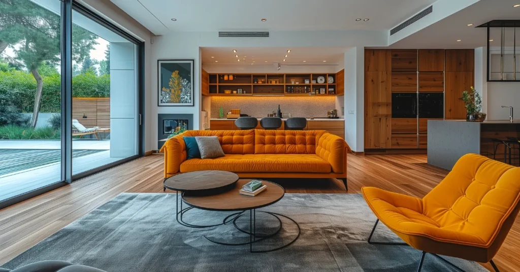
Complementary color combinations have long been a favorite tool among interior designers for creating spaces that are dynamic yet harmonious. Their mastery in applying these colors reflects in spaces that captivate and soothe simultaneously.
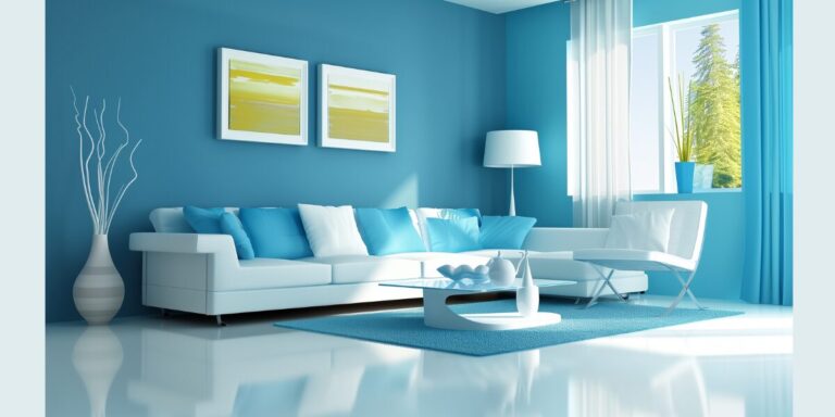
A. Bold and Modern: Many leading interior designers, who favor a bold, modernist approach, often harness complementary colors for maximum visual impact. A classic example is pairing a vibrant blue (a cool color) with a warm orange. This combination not only draws the eye but also creates an inviting atmosphere, perfect for modern living spaces.
B. Harmony and Balance: Designers utilize complementary colors like green and magenta or red and green to achieve a sense of balance and harmony. This is particularly crucial in interior design, where the mood and ambiance of a space are influenced by color choices. For instance, a bedroom with soft green walls might feature accents in magenta, offering a restful yet intriguing space. These color choices are carefully planned to evoke specific emotions and establish a particular ambiance.
C. Color and Emotion: The emotional impact of complementary colors is also strategically used in interior design. For example, a living room with yellow and purple accents can create a luxurious yet playful environment, perfect for both relaxation and entertainment.
These real-world applications demonstrate how complementary colors can transform any space, making it not only aesthetically pleasing but also emotionally resonant.
Practical tips for using complementary colors
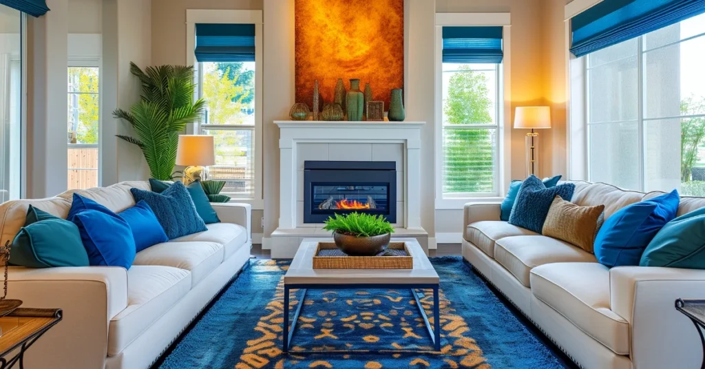
Effectively using complementary colors can elevate a design from ordinary to extraordinary. Here are some practical tips and tools to help you navigate this vibrant journey:
A. Tools for Finding Complementary Colors:
- Color Wheel: This classic tool is indispensable for identifying complementary colors such as blue and orange or yellow and purple.
- Online Color Palette Generators: Websites like Adobe Color or Coolors.co can assist you in finding and visualizing complementary color schemes.
- Mobile Apps: Various apps allow you to capture colors from your environment and find their complements, making color selection more accessible and accurate.
B. Using Complementary Colors in Interior Design:
- Choose One Dominant Color: Use one of the complementary colors as the primary hue in your space, with the other serving as an accent.
- Experiment with Tints and Shades: Different tints, tones, and shades of your chosen complementary colors, like a deep cyan or a muted red, can add depth and subtlety to your design.
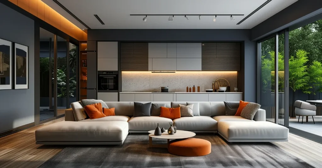
- Balance with Neutrals: Incorporating neutral colors like white, black, or gray can help balance the intensity of complementary colors, ensuring your space doesn’t feel overwhelming.
C. Examples of Successful Use of Complementary Colors in Various Design Projects:
- Public Spaces: A lobby with green and magenta walls and red furniture creates an inviting and vibrant atmosphere.
- Home Interiors: A bedroom with blue walls and yellow accents offers a serene yet stimulating environment.
- Commercial Designs: Restaurants often use complementary colors like orange and blue to create an atmosphere that is both lively and appealing.
By understanding and applying these principles and tools, anyone can create visually stunning spaces that are both balanced and engaging, harnessing the true potential of complementary colors.
Conclusion
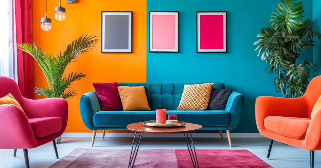
Our exploration through the vibrant world of Complementary Colors underscores their significant impact in both design and art. When these colors are paired, they create a visual harmony that’s not only captivating but also highly effective. Their unique ability to enhance each other’s vibrancy and create striking contrast is fundamental in achieving balance and interest in a variety of creative works.
In conclusion, the power of Complementary Colors lies in their versatility and the emotional responses they can elicit. Whether it’s in the bold branding of a company, the serene ambiance of a living room, or the dynamic energy of a piece of art, these colors are pivotal in creating designs that are memorable and impactful. A deep understanding and skillful application of Complementary Colors allow artists and designers to craft works that are not only visually appealing but also emotionally resonant with their audience.
As we’ve seen, whether it’s in harmonious interior design or compelling brand identities, the thoughtful use of Complementary Colors can transform any project, making it stand out in a world full of color.

