
By Inside Decors · Updated January 15, 2026
Affiliate Disclosure: This article contains affiliate links. If you make a purchase through these links, we may earn a small commission at no additional cost to you.
Creating a cohesive, visually stunning interior doesn’t require a degree in color theory—but understanding analogous color schemes will transform how you approach every room in your home. These harmonious palettes, built from colors that sit side-by-side on the color wheel, deliver the perfect balance of unity and subtle contrast that makes professional designs feel effortless.
After working with dozens of clients struggling to choose paint colors and coordinate furnishings, I’ve seen firsthand how analogous schemes eliminate the guesswork. Whether you’re refreshing a single room or planning a whole-home palette, this guide will show you exactly how to select, balance, and implement analogous colors with confidence—including real measurements, budget ranges, and the specific mistakes to avoid.
Key Takeaways
- Analogous colors are three adjacent hues on the color wheel (like blue, blue-green, and green) that create naturally harmonious schemes
- Apply the 60-30-10 rule: 60% dominant color, 30% secondary, 10% accent for balanced distribution
- Cool analogous palettes (blues, greens, purples) work best in bedrooms and bathrooms; warm palettes (reds, oranges, yellows) energize living and dining spaces
- Test paint samples in your actual lighting—north-facing rooms skew cool, south-facing warm
- Budget $200–$800 for a room refresh using analogous colors (paint, textiles, accessories)
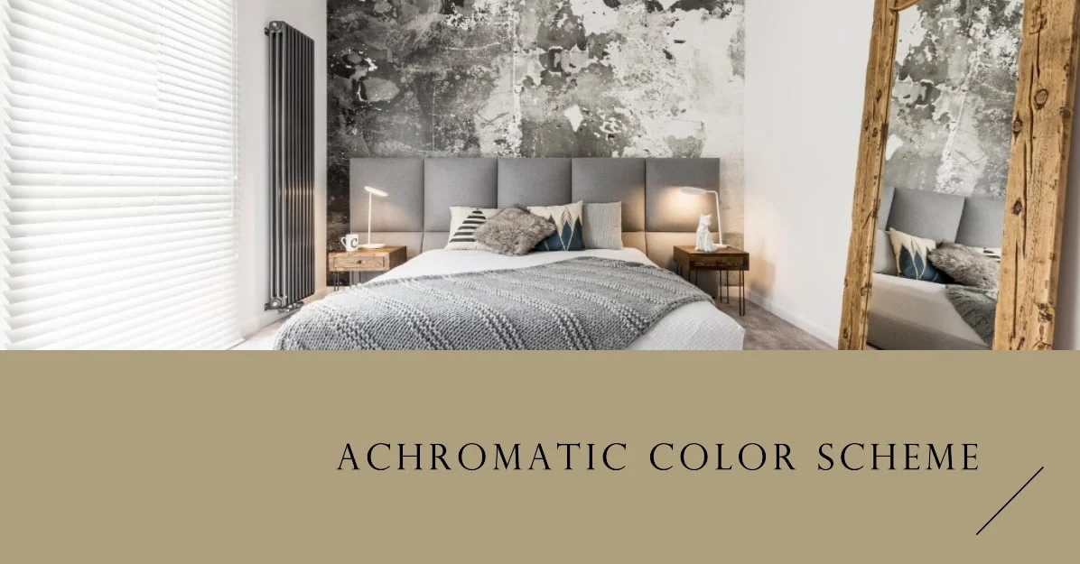
- Pair analogous schemes with neutrals (white, gray, beige) to prevent visual overwhelm
Understanding Analogous Colors: The Foundation of Harmonious Design

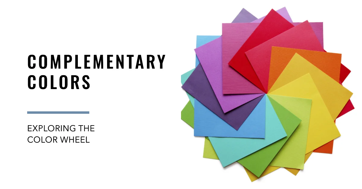
Analogous colors are any three consecutive hues on the standard 12-segment color wheel. Unlike complementary colors that sit opposite each other and create high contrast, analogous colors share an underlying pigment, making them naturally compatible.
Here’s what makes them work: when you choose blue, blue-green, and green, all three contain blue. This shared DNA creates visual flow while the slight shifts in hue add just enough variation to keep the eye engaged. In nature, you see this constantly—think of a forest canopy transitioning from yellow-green new growth to deep emerald pine, or a sunset melting from golden yellow through orange into coral pink.
The technical reason these combinations feel “right” relates to how our eyes process color. The cone cells in our retinas respond to overlapping wavelengths, so adjacent colors on the spectrum require less adjustment as we scan a space. This creates a subconscious sense of ease that complementary or triadic schemes (which jump across the wheel) don’t provide.
Common analogous combinations:
– Cool palettes: Blue → Blue-Violet → Violet | Blue → Blue-Green → Green | Green → Yellow-Green → Yellow
– Warm palettes: Red → Red-Orange → Orange | Orange → Yellow-Orange → Yellow | Red → Red-Violet → Violet
The key distinction: one color typically dominates (your walls or largest furniture pieces), one supports (upholstery, window treatments), and one accents (pillows, art, accessories). This hierarchy prevents the scheme from feeling flat or monotonous.
The Science Behind Why Analogous Colors Work

Color theory isn’t abstract—it’s rooted in physics and human perception. The visible light spectrum runs from approximately 380nm (violet) to 700nm (red). When we arrange these wavelengths in a circle (the color wheel), adjacent colors differ by roughly 30–60nm, a small enough shift that our eyes perceive them as related rather than contrasting.
Primary colors (red, yellow, blue) form the foundation. Mix two primaries and you get secondary colors (orange, green, violet). Mix a primary with an adjacent secondary and you create tertiary colors (red-orange, yellow-green, blue-violet, etc.). Analogous schemes typically include one primary or secondary as the anchor, flanked by tertiary variations.
But here’s what most articles miss: value (lightness/darkness) and saturation (intensity) matter as much as hue. A scheme of navy blue, medium teal, and pale seafoam is analogous, but the value range creates depth. If all three colors have identical value and saturation, the result feels flat—like a paint-by-numbers kit.
In my own living room, I used a blue-green analogous palette but varied the saturation dramatically: deep teal walls (high saturation), dusty sage sofa (medium saturation), and pale mint accents (low saturation). This created layers that photographs beautifully and feels sophisticated in person.
Psychological impact also varies by temperature:
– Cool analogous schemes (blues, greens, purples) lower perceived room temperature by 2–4°F and reduce heart rate—ideal for bedrooms, bathrooms, and meditation spaces
– Warm analogous schemes (reds, oranges, yellows) increase energy and appetite—perfect for kitchens, dining rooms, and creative studios
Understanding this science helps you choose not just pretty colors, but functional ones that support how you actually use each space.
How to Build an Analogous Color Scheme: Step-by-Step

Step 1: Choose Your Dominant Color Based on Room Function
Start with the color that will cover 60% of your space—usually walls, but sometimes a large sectional or area rug. Consider:
- Bedrooms: Cool blues, greens, or violets promote rest (I recommend Benjamin Moore’s “Palladian Blue” 2057-50 or Sherwin-Williams “Sea Salt” SW 6204)
- Living rooms: Flexible—warm schemes for north-facing rooms, cool for south-facing
- Kitchens/dining: Warm yellows, oranges, or reds stimulate conversation and appetite
- Home offices: Yellow-greens and blue-greens enhance focus without sedation
Pro tip: Paint a 2’×2′ sample on at least two walls—one that gets morning light, one that gets afternoon light. Live with it for 3–5 days. Colors shift dramatically based on natural light direction.
Step 2: Select Your Secondary Color (30% of the Scheme)
This color appears in mid-sized elements: upholstery, curtains, bedding, or a feature wall. It should be one step away on the color wheel from your dominant color.
If your dominant is blue, your secondary might be blue-green or blue-violet. Vary the value or saturation to create interest—if your walls are a light, airy blue, choose a richer, more saturated blue-green for your sofa.
Budget reality check: Reupholstering a standard sofa costs $600–$1,200. If that’s not feasible, use a slipcover ($80–$200) or invest in large throw blankets in your secondary color draped over existing furniture.
Step 3: Pick Your Accent Color (10% of the Scheme)
This is your “pop”—the color that appears in throw pillows, artwork, vases, and small accessories. It’s the third color in your analogous trio, and it can be slightly bolder or more saturated than the other two.
For a blue → blue-green → green scheme, your green accents might be a vibrant emerald or a deep forest tone. This is where you can have fun without commitment—swapping out throw pillows or ceramic vases costs $50–$150 and instantly refreshes the scheme.
Step 4: Layer in Neutrals
Even the most beautiful analogous scheme needs breathing room. Neutrals (white, cream, gray, beige, black) prevent color fatigue and add sophistication. I typically use:
- White or off-white trim and ceilings to frame the color
- Natural wood tones in furniture or flooring (wood reads as a warm neutral)
- Gray or beige in 10–15% of textiles or smaller furniture
A common mistake: choosing a neutral with the wrong undertone. If your analogous scheme is cool (blues and greens), use gray or white with blue undertones. For warm schemes (reds and oranges), choose beige or cream with yellow/pink undertones. Mismatched undertones create a muddy, discordant look.
The 60-30-10 Rule: Your Blueprint for Color Balance
The 60-30-10 rule is interior design’s most reliable formula for distributing color. Here’s how it breaks down in a real 12’×14′ bedroom:
60% Dominant Color (Blue):
– Four walls: approximately 560 sq ft of wall space
– Large area rug: 8’×10′ = 80 sq ft
– Duvet cover and shams
– Total visual weight: ~60%
30% Secondary Color (Blue-Green):
– Upholstered headboard: ~20 sq ft
– Two curtain panels: ~40 sq ft combined
– Accent chair
– Total visual weight: ~30%
10% Accent Color (Green):
– Four throw pillows
– Table lamp base
– Artwork with green tones
– Potted plants (living green counts!)
– Total visual weight: ~10%
Important nuance: These percentages refer to visual weight, not literal square footage. A bright, saturated color commands more attention than a pale, muted one. A vibrant emerald pillow might visually “count” as much as a pale sage chair twice its size.
You can adjust the ratio slightly (55-30-15 or 65-25-10) based on personal preference, but straying too far creates imbalance. I once worked with a client who insisted on 40% dominant, 40% secondary, and 20% accent—the room felt chaotic and lacked a clear focal point.
Analogous Color Schemes by Room: Practical Applications
Living Rooms: The Social Hub
Best analogous schemes: Yellow → Yellow-Green → Green (energizing, welcoming) or Blue → Blue-Violet → Violet (sophisticated, calming)
Real example from my portfolio:
– Dominant (60%): Walls in Sherwin-Williams “Rainwashed” SW 6211 (soft blue-green)
– Secondary (30%): Linen sofa in deeper teal, curtains in blue-green geometric print
– Accent (10%): Emerald velvet pillows, green glass table lamps, botanical prints
Key products:
– Teal velvet sofa slipcover ($120–$180)
– Blue-green geometric curtains ($40–$80 per panel)
– Emerald green throw pillows ($25–$45 each)
This scheme works beautifully in north-facing living rooms that need warmth without going fully warm-toned. For more ideas on brightening living spaces, see our guide on what colors brighten a living room.
Bedrooms: The Retreat
Best analogous schemes: Blue → Blue-Violet → Violet (promotes sleep) or Green → Blue-Green → Blue (restorative, spa-like)
Practical tip: Keep saturation low in bedrooms. Highly saturated colors (even cool ones) can feel stimulating. Aim for soft, muted versions of your chosen hues.
Budget breakdown for a bedroom refresh:
– Paint (2 gallons): $60–$120
– Duvet cover and shams: $80–$150
– Throw pillows (4): $100–$180
– Curtains (2 panels): $80–$160
– Area rug: $150–$400
– Accessories (lamp, art, vase): $80–$150
– Total: $550–$1,160
Recommended products:
– Blue-violet duvet cover set
– Soft blue area rug
– Violet ceramic table lamp
Kitchens and Dining Rooms: The Gathering Spaces
Best analogous schemes: Red → Red-Orange → Orange (appetite-stimulating) or Yellow → Yellow-Orange → Orange (cheerful, energizing)
Caution: Warm schemes can feel overwhelming in small kitchens. If your kitchen is under 100 sq ft, use warm analogous colors as accents (backsplash, bar stools, accessories) rather than wall color.
Real-world application:
– Dominant (60%): Warm white or cream walls (neutral base)
– Secondary (30%): Terracotta or burnt orange backsplash tiles, orange-toned wood cabinets
– Accent (10%): Red-orange bar stools, copper cookware, citrus-themed art
This approach gives you the energy of warm analogous colors without visual overwhelm. For more on creating cohesive design throughout your home, explore our article on top interior design styles and tips.
Bathrooms: The Spa Sanctuary
Best analogous schemes: Blue → Blue-Green → Green (spa-like, clean) or Violet → Blue-Violet → Blue (luxurious, calming)
Practical consideration: Bathrooms have limited wall space due to fixtures, so your “dominant” color often appears in tile, shower curtain, or vanity color rather than wall paint.
Product recommendations:
– Blue-green glass tile (backsplash or shower accent)
– Teal bath towels
– Green botanical shower curtain
When selecting bathroom fittings to complement your color scheme, our guide on how to choose the right bathroom fittings offers detailed advice on finishes and styles.
Analogous Color Scheme Comparison: Finding Your Perfect Match
| Color Scheme | Temperature | Best Rooms | Psychological Effect | Difficulty Level | Budget Impact |
|---|---|---|---|---|---|
| Blue → Blue-Green → Green | Cool | Bedrooms, bathrooms, home offices | Calming, restorative, focus-enhancing | Easy (widely available products) | Low-Medium ($400–$900) |
| Yellow → Yellow-Green → Green | Warm-to-Cool | Kitchens, breakfast nooks, sunrooms | Energizing yet balanced, nature-inspired | Medium (requires careful saturation control) | Medium ($500–$1,000) |
| Red → Red-Orange → Orange | Warm | Dining rooms, accent walls, creative studios | Stimulating, appetite-enhancing, bold | Hard (can overwhelm small spaces) | Medium-High ($600–$1,200) |
| Violet → Blue-Violet → Blue | Cool | Bedrooms, reading nooks, powder rooms | Luxurious, sophisticated, calming | Medium (harder to find violet furnishings) | Medium-High ($700–$1,300) |
| Yellow → Yellow-Orange → Orange | Warm | Living rooms, playrooms, entryways | Cheerful, welcoming, optimistic | Easy-Medium (many product options) | Low-Medium ($400–$800) |
How to use this table: Match your room’s function and your personal energy preference (calming vs. energizing) to find your starting point. Budget impact includes paint, textiles, and key accessories for one average-sized room (12’×14′).
Common Mistakes When Using Analogous Color Schemes (And How to Fix Them)
Mistake #1: Identical Saturation Across All Three Colors
The problem: When all three colors have the same intensity, the scheme feels flat and one-dimensional—like a gradient rather than a designed space.
The fix: Vary saturation intentionally. If your dominant color is highly saturated (like a rich navy), make your secondary color medium saturation (soft teal), and your accent low saturation (pale mint) or vice versa.
Mistake #2: Ignoring Undertones in Neutrals
The problem: You’ve nailed your blue-green-yellow scheme, but the beige sofa you kept looks dingy and out of place.
The fix: Beige has pink or yellow undertones. If your scheme is cool (blues and greens), that warm beige will clash. Either replace it with a gray-based neutral or shift your entire scheme warmer to accommodate it. Sometimes the “wrong” neutral costs you more in visual discord than replacing it would cost in dollars.
Mistake #3: Forgetting About Lighting
The problem: Your paint looked perfect in the store but reads completely different at home.
The fix:
– North-facing rooms receive cool, bluish light—warm analogous schemes (reds, oranges, yellows) can balance this
– South-facing rooms get warm, golden light—cool schemes (blues, greens, purples) prevent the space from feeling too hot
– East-facing rooms get warm morning light, cool afternoon light—choose schemes that work in both conditions
– West-facing rooms get cool morning light, intense warm afternoon light—medium-saturation cool schemes work best
Always test paint samples on multiple walls and observe them at different times of day for at least 48 hours.
Mistake #4: Neglecting Texture
The problem: Even a perfectly balanced analogous scheme can feel boring if every surface is the same texture.
The fix: Layer textures within your color scheme:
– Dominant color: Matte wall paint + plush velvet sofa
– Secondary color: Linen curtains + woven throw blanket
– Accent color: Glossy ceramic vase + nubby wool pillow
Texture creates visual interest that prevents analogous schemes from feeling too “matchy-matchy.” In my own boho living room, I used a green-yellow-orange analogous scheme but varied textures from macramé to leather to rattan—the color harmony unified it while texture kept it interesting.
Mistake #5: Skipping the Neutral Buffer
The problem: Wall-to-wall color with no visual rest points creates fatigue.
The fix: Use white or off-white for trim, ceilings, and at least one major element (like a neutral sofa or rug). This gives the eye a place to rest and makes your analogous colors pop rather than blur together.
Advanced Techniques: Elevating Your Analogous Scheme
Technique #1: The Monochromatic Analogous Hybrid
Choose one color and use three different values (light, medium, dark) of that single hue, then add one adjacent color as a subtle accent. For example:
- Dominant: Light blue walls
- Secondary: Medium blue sofa
- Accent: Dark navy curtains + small touches of blue-green in pillows
This creates incredible depth while maintaining the harmony of an analogous scheme. It’s particularly effective in small spaces where too many distinct colors can feel chaotic.
Technique #2: The Complementary Pop
Strictly speaking, this breaks the “analogous only” rule—but it works. Add a tiny amount (2–5%) of the complementary color to your dominant hue for strategic contrast.
If your scheme is blue → blue-green → green, add a single orange pillow or a piece of orange-toned artwork. This tiny pop of complementary contrast makes the entire analogous scheme feel more vibrant without disrupting the harmony.
Technique #3: Metallic Bridges
Use metallic finishes (brass, copper, gold, silver, bronze) to bridge your analogous colors and add sophistication:
- Warm analogous schemes (reds, oranges, yellows): Use brass, copper, or gold
- Cool analogous schemes (blues, greens, purples): Use silver, chrome, or brushed nickel
Product recommendations:
– Brass table lamps
– Copper planters
– Gold picture frames
Metallics read as neutrals but add warmth (gold-toned) or coolness (silver-toned) that reinforces your scheme’s temperature.
Analogous Colors in Different Design Styles
Modern and Contemporary
Approach: Use analogous colors in their purest, most saturated forms with clean lines and minimal pattern.
Example: A modern living room with charcoal gray walls (neutral base), a cobalt blue sectional (dominant), teal accent chairs (secondary), and turquoise geometric art (accent). Keep patterns minimal—solid colors or simple geometrics only.
Traditional and Transitional
Approach: Use softer, more muted versions of analogous colors with classic patterns (damask, toile, stripes).
Example: A traditional bedroom with soft sage walls (dominant), blue-green floral curtains (secondary), and pale yellow accent pillows (accent). Layer in cream and ivory neutrals for a sophisticated, timeless look.
Bohemian and Eclectic
Approach: Use analogous colors as a unifying thread through diverse patterns and textures.
Example: A boho living room with terracotta walls (dominant), rust-orange Moroccan rug (secondary), and red-orange patterned pillows (accent). Mix in natural textures like rattan, jute, and macramé. The analogous color scheme keeps the eclectic mix from feeling chaotic. For more boho inspiration, see our guide to boho living room decor.
Approach: Use very pale, desaturated versions of analogous colors with lots of white space.
Example: A Scandinavian bedroom with pale gray-blue walls (dominant), soft seafoam bedding (secondary), and dusty sage accents (accent). Keep 40–50% of the room white or natural wood for that signature Scandi airiness.
Budget-Friendly Ways to Implement Analogous Color Schemes
You don’t need a complete renovation to embrace analogous colors. Here are proven strategies I’ve used with budget-conscious clients:
Strategy #1: Start with Textiles ($150–$300)
Paint is commitment. Textiles are not. Begin with:
– Throw pillows in your three analogous colors ($60–$120 for 4–6 pillows)
– A throw blanket in your secondary color ($30–$60)
– Curtains in your dominant or secondary color ($40–$80 per pair)
Live with these for a few weeks. If you love the scheme, commit to paint.
Strategy #2: DIY Art ($20–$50)
Create your own abstract art using acrylic paints in your analogous colors. Buy three 16″×20″ canvases ($15–$25 for a pack of 3) and acrylic paints ($10–$20). Even simple color-blocked designs look sophisticated when the colors are harmonious.
Strategy #3: Thrift and Repaint ($50–$150)
Find secondhand furniture (side tables, picture frames, lamps) and paint them in your accent color. A $15 thrift store lamp becomes a custom piece with a $10 can of spray paint in your exact shade.
Strategy #4: Strategic Paint ($60–$120)
Instead of painting all four walls, paint one accent wall in your dominant color and keep the other three neutral. This gives you 70% of the impact at 30% of the cost and effort.
Strategy #5: Plants as Living Color ($40–$100)
If your scheme includes green, use living plants as your accent color. A collection of indoor planters in your secondary color (blue-green ceramic pots, for example) filled with lush greenery costs $40–$100 and serves double duty as décor and air purification.
For more budget-conscious design strategies, explore our article on making your home look expensive on a budget.
Analogous Color Schemes for Specific Challenges
Challenge #1: Small Spaces (Under 150 sq ft)
Solution: Use a light, cool analogous scheme (pale blue → pale blue-green → pale green) to visually expand the space. Keep saturation low and value high (meaning light, not dark). Avoid warm, saturated schemes in small rooms—they advance visually and make spaces feel smaller.
Specific recommendation: Benjamin Moore “Palladian Blue” 2057-50 (dominant), “Wythe Blue” HC-143 (secondary), “Sea Salt” (accent). All three are light, cool, and airy.
Challenge #2: Dark Rooms with Limited Natural Light
Solution: Use a warm analogous scheme with high value (light colors) to compensate for lack of light. Yellow → yellow-orange → orange in pale, creamy versions will reflect available light and warm the space.
Avoid: Dark, cool analogous schemes (navy → teal → forest green) will make a dark room feel like a cave.
Challenge #3: Open-Concept Spaces
Solution: Use the same analogous scheme throughout but vary which color dominates in each zone:
– Living area: Blue dominant, blue-green secondary, green accent
– Dining area: Blue-green dominant, green secondary, blue accent
– Kitchen: Green dominant, blue-green secondary, blue accent
This creates flow and cohesion while defining separate zones.
Challenge #4: Rooms with Challenging Fixed Elements
Situation: You have an orange-toned oak floor or a pink-toned granite countertop you can’t change.
Solution: Build your analogous scheme around the fixed element. If you have orange oak floors, use a warm analogous scheme (yellow → yellow-orange → orange) that incorporates the floor as part of the palette rather than fighting it.
Seasonal Variations: Adapting Your Analogous Scheme
One advantage of analogous schemes: you can shift the mood seasonally by adjusting accessories and textiles while keeping the base palette.
Spring/Summer: Lighten and Brighten
- Swap heavy velvet pillows for linen or cotton in lighter values of your colors
- Add white or cream accents to increase airiness
- Incorporate fresh flowers in your accent color
Fall/Winter: Deepen and Warm
- Introduce richer, more saturated versions of your colors in throws and pillows
- Layer in warm metallics (brass, copper)
- Add texture with wool, velvet, and faux fur in your secondary color
Example: A blue → blue-green → green living room might have:
– Summer: Pale blue linen pillows, seafoam cotton throw, white ceramic vases with green stems
– Winter: Navy velvet pillows, teal wool throw, brass vases with evergreen branches
Same base scheme, completely different seasonal feel—and you only need to store/swap about $150–$200 worth of accessories.
Shop This Look
Editor-picked finds to bring this style home:
- Velvet Armchair →Adds luxurious texture and a rich, deep hue to your analogous palette.
- Ceramic Table Lamp →Provides ambient light and introduces a subtle, complementary color accent.
- Abstract Area Rug →Grounds the space with a soft, blended color transition across the floor.
- Textured Throw Pillows →Offers easy, interchangeable pops of color and tactile interest.
As an Amazon Associate we earn from qualifying purchases.
Frequently Asked Questions
What’s the difference between analogous and monochromatic color schemes?
Monochromatic schemes use variations (tints, tones, shades) of a single hue—for example, light blue, medium blue, and navy are all monochromatic. Analogous schemes use three different hues that sit next to each other on the color wheel—like blue, blue-green, and green. Analogous schemes offer more variety while maintaining harmony, whereas monochromatic schemes create a more subtle, sophisticated look with less contrast.
Can I use an analogous color scheme in a room with existing furniture I can’t replace?
Absolutely. Start by identifying the undertone of your existing furniture—is it warm or cool? Then choose an analogous scheme that matches that temperature. If you have a beige sofa with warm undertones, use a warm analogous scheme (yellows, oranges, reds). If you have gray furniture with cool undertones, choose a cool scheme (blues, greens, purples). You can also use slipcovers or large throws to temporarily shift a piece’s color to fit your scheme.
How do I choose between a warm and cool analogous color scheme?
Consider three factors: (1) Room function—bedrooms and bathrooms benefit from cool, calming schemes; living rooms and kitchens often work better with warm, energizing schemes. (2) Natural light—north-facing rooms need warm schemes to compensate for cool light; south-facing rooms can handle cool schemes. (3) Personal preference—if you run cold, you’ll likely prefer warm schemes; if you run hot, cool schemes will feel more comfortable. Test paint samples in your actual space before committing.
What’s the biggest mistake people make with analogous color schemes?
Using all three colors at the same saturation and value level, which creates a flat, one-dimensional look. The key to successful analogous schemes is varying the intensity—use one color in a bold, saturated version, one in a medium saturation, and one in a pale or muted version. This creates depth and visual interest while maintaining the harmony that makes analogous schemes work.
How much does it cost to implement an analogous color scheme in an average bedroom?
For a 12’×14′ bedroom, expect to spend $400–$1,200 depending on what you’re replacing. A budget refresh (paint, new bedding, pillows, and a few accessories) runs $400–$600. A mid-range update (paint, bedding, curtains, area rug, and accessories) costs $700–$900. A high-end transformation (paint, upholstered headboard, custom curtains, quality rug, and curated accessories) ranges from $1,000–$1,500. You can phase the project over several months to spread costs.
Do analogous color schemes work in modern farmhouse or industrial styles?
Yes, but you’ll want to use more muted, desaturated versions of your analogous colors. For modern farmhouse, try soft sage → dusty blue-green → pale blue with lots of white and natural wood. For industrial, consider charcoal → slate blue → steel blue with black metal and concrete accents. The key is keeping the colors subtle and letting texture and materials (wood, metal, concrete) play a major role in the design. For more on creating cohesive style throughout your home, see our guide to the 7 principles of interior design.
Bringing It All Together: Your Analogous Color Action Plan
You now have the complete framework for implementing analogous color schemes with confidence. Here’s your step-by-step action plan:
Week 1: Research and Selection
1. Identify your room’s function, lighting conditions, and existing fixed elements
2. Choose your three analogous colors using the color wheel
3. Determine which will be dominant (60%), secondary (30%), and accent (10%)
4. Order paint samples and fabric swatches
Week 2: Testing
1. Paint 2’×2′ samples on multiple walls
2. Observe in morning, afternoon, and evening light
3. Hold fabric swatches against the paint in different lighting
4. Adjust saturation or value if needed
Week 3: Foundation
1. Paint walls in your dominant color (or hire a painter: $200–$400 for an average bedroom)
2. Order or install any large secondary-color elements (curtains, area rug, upholstery)
Week 4: Layering
1. Add accent color through pillows, art, and accessories
2. Incorporate neutrals and metallics
3. Layer textures within your color scheme
4. Step back and adjust proportions if needed
Ongoing: Seasonal Refreshes
– Swap out 10–20% of accessories seasonally to keep the scheme feeling fresh
– Adjust saturation and value with the seasons (lighter in summer, richer in winter)
– Add or remove neutrals to shift the mood
The beauty of analogous color schemes is their flexibility. Unlike high-contrast schemes that can feel dated quickly, analogous palettes have a timeless quality that allows you to evolve your space over years without starting from scratch.
Whether you’re drawn to the serene sophistication of blue-green-violet or the energizing warmth of yellow-orange-red, you now have the tools to create a space that feels both harmonious and uniquely yours. Start small if you’re hesitant—a collection of throw pillows and a piece of art can test your scheme before you commit to paint.
The most successful interiors aren’t about following trends—they’re about understanding principles like analogous color theory and applying them in ways that reflect your lifestyle, preferences, and the unique characteristics of your space. Now go create something beautiful.
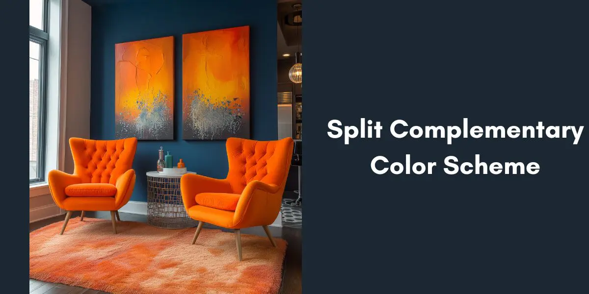
Looking for more color theory guidance? Explore our comprehensive guide to complementary colors in interior design or learn about split complementary color schemes for a different approach to color harmony.