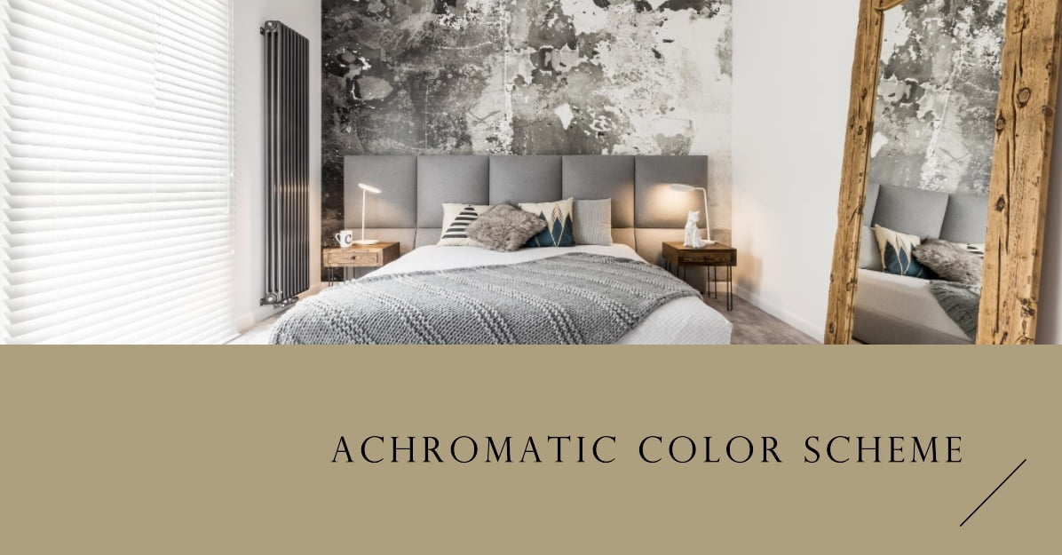
An achromatic color scheme is one devoid of color, relying solely on shades of black, white, and the myriad grays in between.
Now, you might wonder, in an age where design celebrates bold hues and vivid patterns, why does the achromatic theme still hold ground? The answer lies in its timeless elegance and versatility.
Today’s design world is shifting towards minimalism, and the achromatic palette perfectly encapsulates this ethos. It offers a canvas that’s both neutral and striking, making it a go-to choice for designers aiming for sophistication with a modern twist.
Understanding Achromatic Design: The Basics
Colors play an instrumental role in our lives, influencing our moods, decisions, and perceptions. To truly appreciate the nuances of design and aesthetics, one must first understand the basics of colors.
Chromatic vs. Achromatic: At the very heart of understanding colors is distinguishing between chromatic and achromatic. Chromatic colors are those that have a hue, meaning they fall somewhere on the spectrum of the rainbow—think of the vibrant reds, blues, and greens that catch your eye. These colors are often associated with emotions, symbolism, and cultural contexts.
On the other hand, achromatic colors—derived from the Greek word ‘achromos’ meaning ‘without color’—consist of blacks, whites, and grays. They lack hue and saturation, resulting in a palette that’s neutral, yet profoundly expressive. While they might seem simple at first glance, their power lies in the depth, contrast, and elegance they bring to designs.
The Color Wheel and Achromatic’s Place: Imagine a wheel brimming with colors—a tool that artists and designers swear by. This is the color wheel, a circular representation of colors based on their chromatic relationship. Typically, it showcases primary, secondary, and tertiary colors, all radiating out in a vibrant display.
Now, where does achromatic fit into this wheel? Technically, it doesn’t. Achromatic colors sit outside the wheel, representing the absence of hue. Think of them as the silent guardians of the color world. They can be integrated with other hues to adjust brightness, create shadows, or even add depth. Achromatic colors act as the balancing force amidst the cacophony of vibrant hues, grounding designs and bringing a sense of calm and sophistication.
What is an Achromatic Color Scheme?
When you think of colors, your mind might instantly wander to the vivid shades of a summer sunset or the pastel hues of a spring morning. But amidst this riot of colors, there exists a palette that’s both understated and profound—the achromatic color scheme. Let’s take a closer look:
The Science Behind Achromatic Colors: The world of colors is guided by two primary attributes: hue and saturation. Hue refers to the color itself, like red, blue, or yellow. Saturation, on the other hand, describes the intensity or purity of that color. Dive into the realm of achromatic, and you’ll find an absence of both these attributes. Achromatic colors have no hue and no saturation, making them void of any specific color characteristic. It’s this very absence that gives them their unique identity and versatility.
Shades, Tones, and Tints: The Grayscale Spectrum: Achromatic isn’t just about stark blacks and pristine whites. Between these two extremes lies a vast spectrum of grays, each carrying its own charm and message. When we talk about the grayscale spectrum, we’re referring to the different variations achieved by adding black or white to a color.
- Shades: These are created when you add black to a color, making it darker. In the achromatic world, this means transitioning from gray to a deeper, almost charcoal black.
- Tones: When both black and white (or gray) are added to a color, you get a tone. In the achromatic scheme, this would be the mid-grays that bridge the gap between the light and dark ends of the spectrum.
- Tints: Add white to a color, and you get a tint. For achromatic, this results in the softer, lighter grays, gradually moving towards pure white.
This grayscale spectrum is a playground for designers, allowing them to craft depth, contrast, and emotion, all while staying within the achromatic boundaries. Whether it’s the muted gray of a rainy day or the sharp contrast of a monochrome photograph, the achromatic color scheme is a testament to the power of subtlety.
Benefits of Using Achromatic Colors
Colors have the power to evoke emotions, convey messages, and create lasting impressions. Among them, the achromatic palette holds a unique charm, offering designers and artists a range of benefits that go beyond the visual. Let’s delve into why this color scheme is so revered:
Timeless Appeal and Versatility:
In the ever-evolving world of design, trends come and go, but the achromatic color scheme remains a constant favorite. Its simplicity and neutrality give it a timeless quality. Whether you’re looking at a black and white photograph from the 1920s or a modern minimalist interior, the achromatic scheme never feels out of place or outdated. Its versatility is unmatched—be it in fashion, where monochrome outfits exude elegance, or in branding, where black and white logos stand out with sheer sophistication. This adaptability ensures that achromatic colors fit seamlessly into any era, style, or medium.
Psychological Impact on Viewers:
Colors have a profound impact on our psyche, and the achromatic palette is no exception. The absence of hue and saturation in achromatic designs allows viewers to focus on content, shape, and texture without distractions. This can evoke a range of emotions:
- Black: Often associated with power, elegance, and formality, it can also signify mystery or the unknown.
- White: It symbolizes purity, innocence, and simplicity. In design, it offers a sense of space and openness.
- Grays: These bridge the gap between black and white, representing neutrality and balance. Depending on the shade, gray can convey sophistication, professionalism, or even a sense of calm.
Using achromatic colors can also lead to heightened emotional responses. For instance, black and white photographs can feel more emotive and raw compared to their colored counterparts. The lack of color compels viewers to seek emotion in expressions, shadows, and contrasts, making the experience deeply personal and introspective.
Practical Applications of Achromatic Colors in Interior Design and Decor

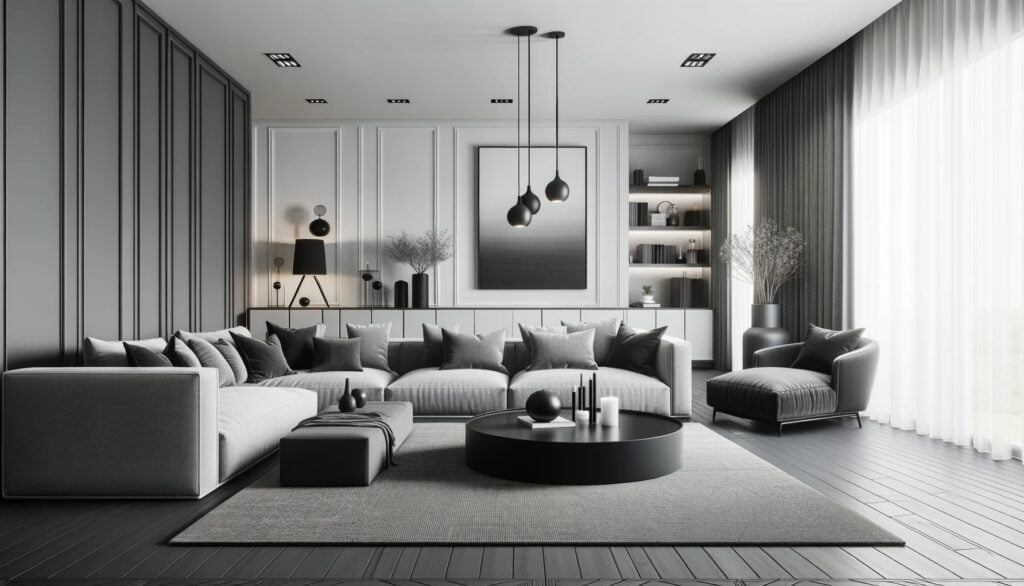
In the expansive world of interior design, the achromatic palette emerges as a beacon of sophistication and versatility. With shades of black, white, and gray, these colors can transform any space, giving it an air of elegance and modernity.
Crafting Sophisticated Spaces with Achromatic Tones
Achromatic interiors are a blend of luxury and serenity. Envision a living room where soft grays contrast beautifully with stark white walls, all accentuated by bold black touches. Such a setting doesn’t just look luxurious; it feels inviting, offering a retreat from the bustling world outside.
Balancing Shades and Introducing Texture
Success in achromatic interior design hinges on striking the right balance. It’s essential to understand the dynamics between different shades and how they can complement each other. A muted gray sectional might be juxtaposed against a deep black feature wall, while white cushions or decor items can bring in brightness. Texture is equally crucial. A soft gray velvet couch, a sleek white marble tabletop, or a rugged monochrome rug can add layers, making the space feel rich and dynamic.
A Timeless Choice for Varied Styles
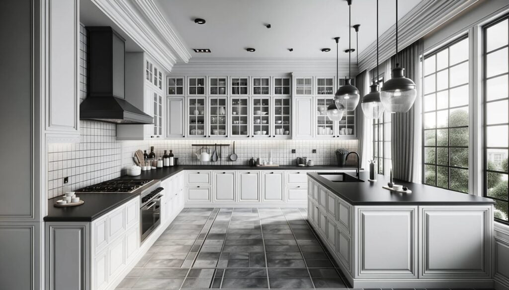
The adaptability of the achromatic palette is its standout feature. Be it a contemporary urban loft, a cozy country-style living space, or a retro-themed room, achromatic colors fit the bill perfectly. A minimalist bedroom might celebrate the simplicity of black and white, while a classic kitchen could have monochrome tiles setting the tone. Every space, big or small, can benefit from the charm of achromatic hues.
In essence, achromatic interiors are about making bold statements with subtle shades. They resonate with a sense of timeless beauty, ensuring that spaces not only look impeccable but also exude a warmth and character that’s truly unmatched. Whether you’re a seasoned designer or someone looking to spruce up your home, the achromatic palette promises a journey of creativity and elegance.
Tips for Implementing Achromatic Themes in Interior Design

The allure of achromatic interiors lies in their timeless elegance and the ability to create serene yet striking spaces. However, to truly harness the potential of this palette, one needs a few tricks up their sleeve. Here are some expert tips to master the art of achromatic design:
Balancing Shades for Depth and Dimension
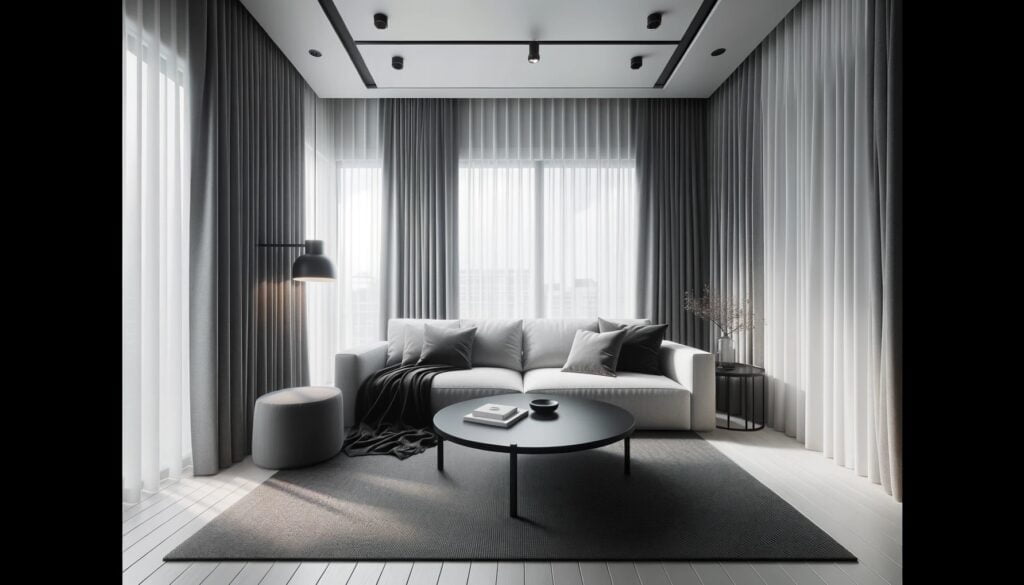
Just like in a gourmet dish, balance is key. In achromatic design, this means ensuring that blacks, whites, and grays coexist harmoniously. Too much black can make a space feel heavy, while an excess of white might render it stark. Intersperse darker shades with lighter ones to add depth. For instance, a deep gray wall can be beautifully offset by lighter gray furnishings, creating a sense of dimension and movement in the room.
Introducing Textures to Break Monotony
While the achromatic palette is inherently sophisticated, it runs the risk of becoming monotonous if not handled with care. The solution? Texture. Mix and match different materials to keep the space engaging. Think soft, plush cushions against a sleek leather sofa or a rugged stone wall paired with glossy tiled flooring. These textural contrasts add layers to the design, ensuring the space feels rich and dynamic.
Infusing Pops of Color: When and How
Achromatic doesn’t mean you’re restricted to only blacks, whites, and grays. In fact, occasional pops of color can elevate your design to new heights. The key is subtlety. A vibrant artwork on a gray wall, a bold-colored vase on a white shelf, or even colorful books on a coffee table can introduce elements of surprise. These splashes of color not only break the monotony but also draw attention to specific areas, allowing you to guide the viewer’s gaze.
In conclusion, while the achromatic theme offers a canvas of endless possibilities, it’s the finer details that make the design truly shine. By balancing shades, playing with textures, and introducing strategic color pops, you can transform any space into an achromatic masterpiece that’s as captivating as it is comforting.
Mistakes to Avoid in Achromatic Interior Design
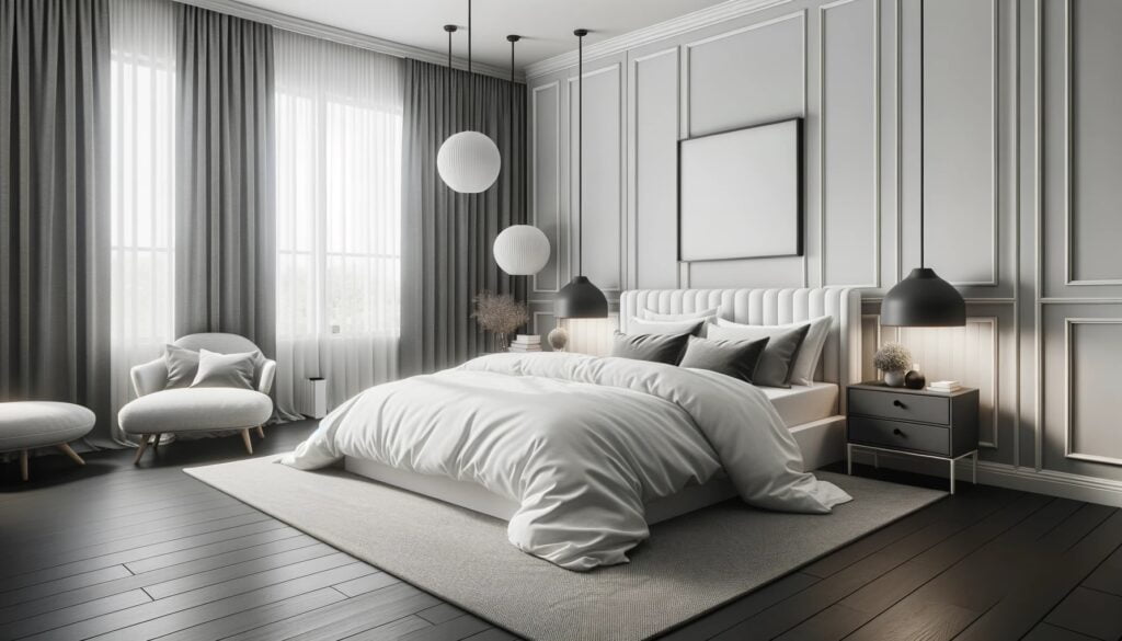
The achromatic palette, with its refined shades of black, white, and gray, offers a world of design possibilities. However, like any design theme, there are pitfalls that can disrupt its inherent beauty. Here are some common mistakes to steer clear of when embracing the achromatic design:
Overwhelming with Too Much Darkness or Lightness
While the achromatic palette is all about balance, it’s easy to tip the scales too far in one direction. A room dominated by dark shades can feel closed in, somber, and even oppressive. Conversely, an excess of light shades might make the space feel too stark, cold, or impersonal. The trick is to find that sweet spot where both ends of the spectrum complement each other, ensuring the room feels cozy yet spacious.
Ignoring Room Lighting in Interior Design Applications
Lighting plays a pivotal role in shaping the ambiance of a space, more so when dealing with achromatic designs. Relying solely on natural light can sometimes cast unwanted shadows, especially in rooms with darker furnishings. On the flip side, overly bright artificial lighting in a predominantly white room can make the space feel clinical. It’s essential to consider the source, intensity, and type of lighting. Soft, ambient lights can add warmth to gray tones, while accent lighting can highlight specific decor elements or architectural features. Remember, in achromatic design, lighting isn’t just functional—it’s an integral part of the aesthetic.
Crafting an achromatic interior is an art that requires attention to detail and an understanding of the nuances of the palette. By being mindful of these common pitfalls and approaching the design with a balanced perspective, you can create spaces that are not only visually stunning but also exude warmth, depth, and character.
Key Takeaways from Achromatic Design Principles
As we reflect on our exploration of this timeless palette, here are some standout insights to keep in mind:
1. Beyond Black and White: The Essence of Balance
Achromatic isn’t merely about contrasting black and white. It’s an intricate dance of shades, capturing everything from the profound depth of black to the serene purity of white and the myriad grays in between. The real charm shines through when these shades are used in harmony, painting spaces that resonate with both energy and calm.
2. A Palette of Endless Possibilities
The adaptability of the achromatic scheme knows no bounds. While its magic in interior design is undeniable, it gracefully extends its touch to other realms, be it the sophisticated world of fashion or the striking realm of graphic design. It’s a testament to the power of simplicity and restraint.
3. The Magic Lies in the Details
Texture and subtle details play a starring role in achromatic design. Introducing different textures, like the plush feel of a fabric or the rugged surface of a wall, can dramatically transform a space. And while the palette predominantly revolves around shades of gray, the occasional burst of color can make a world of difference, adding depth and a touch of surprise.
With its enduring allure and the breadth of opportunities it presents, the achromatic palette remains a cherished tool in the design world. Armed with these insights, you’re well-equipped to navigate and appreciate the myriad wonders of achromatic design.
Conclusion
The achromatic color scheme, with its elegant dance of blacks, whites, and grays, has a timeless allure that transcends trends and eras. Its ability to craft spaces that are both dynamic and serene, to convey depth with simplicity, and to evoke emotion without relying on a spectrum of hues, speaks to its enduring charm. It’s a palette that resonates with both the past and the present, seamlessly bridging the gap between vintage charm and modern sophistication.
Yet, the true magic of achromatic design lies not just in its inherent beauty but in the endless possibilities it presents. It’s a canvas that beckons each one of us to experiment, to play, and to find our unique voice within its shades. Whether you’re a seasoned designer or someone just starting to dip your toes into the world of design, the achromatic palette offers a journey of discovery.
Read our latest article on Split Complementary Colors in Interior Design.

