Color is more than just a visual experience; it’s a powerful design tool that can transform a space, evoke emotions, and even influence our thoughts and behaviors. Whether you’re a seasoned interior designer, a DIY decorator, or simply someone with a keen interest in home decor, understanding color is crucial.
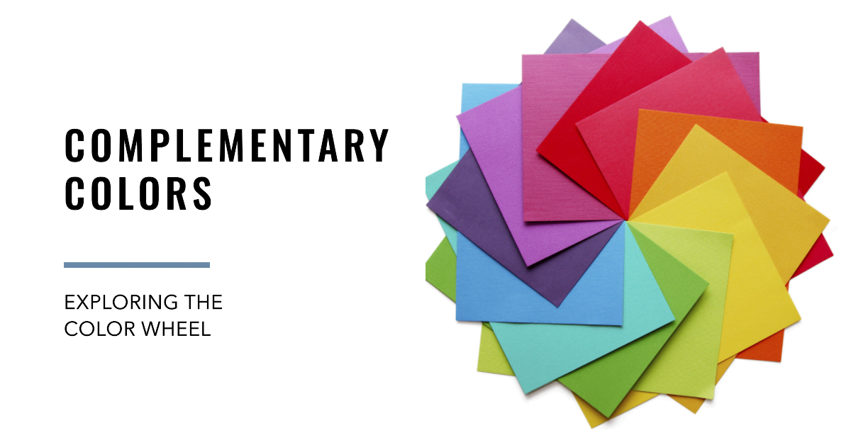
In this article, we’re going to explore one of the most intriguing aspects of color theory: complementary colors. These are the colors that sit opposite each other on the color wheel, and when used together, they create a vibrant, dynamic look that’s truly eye-catching.
But we’re not stopping there. We’ll also dive into the fundamentals of color theory, explore the color wheel, and even discuss modern color models like RGB and CMYK. By the end of this journey, you’ll have a solid understanding of how to use complementary colors to transform your space into a stunning masterpiece. So, are you ready to unlock the power of color in your interior design? Let’s get started!
The Fundamentals of Color Theory
Alright, let’s dive right in and start with the basics: color theory. Now, you might be thinking, “What does theory have to do with my living room decor?” Well, quite a lot, actually! Color theory is the cornerstone of design, and it’s what allows us to create spaces that are not just beautiful, but also harmonious and balanced.
Color theory is a framework that designers use to understand and utilize color effectively. It’s like a roadmap that guides us in choosing and combining colors in a way that’s pleasing to the eye. It’s based on the color wheel, a circular diagram of colors arranged by their chromatic relationship.
Now, let’s bring this concept to life with a real-world example. Imagine you’re redecorating your living room. You’ve chosen a gorgeous royal blue sofa, and now you’re trying to decide on the perfect color for your throw pillows. You want something that will make your sofa pop, but also blend seamlessly with the rest of your decor. This is where color theory comes in.
According to color theory, the complementary color to blue is orange. So, an orange throw pillow would create a vibrant contrast, making your blue sofa stand out even more. But if you want a more harmonious look, you could choose pillows in analogous colors, like green or purple, which are next to blue on the color wheel.
See how that works? Color theory gives us a set of rules to follow, but it also leaves plenty of room for creativity and personal style. And that’s what makes it such a powerful tool in interior design. So, as we move forward, keep in mind that understanding color theory is your first step towards creating a space that’s not just stylish, but also uniquely you.
The Color Wheel: The Backbone of Color Theory
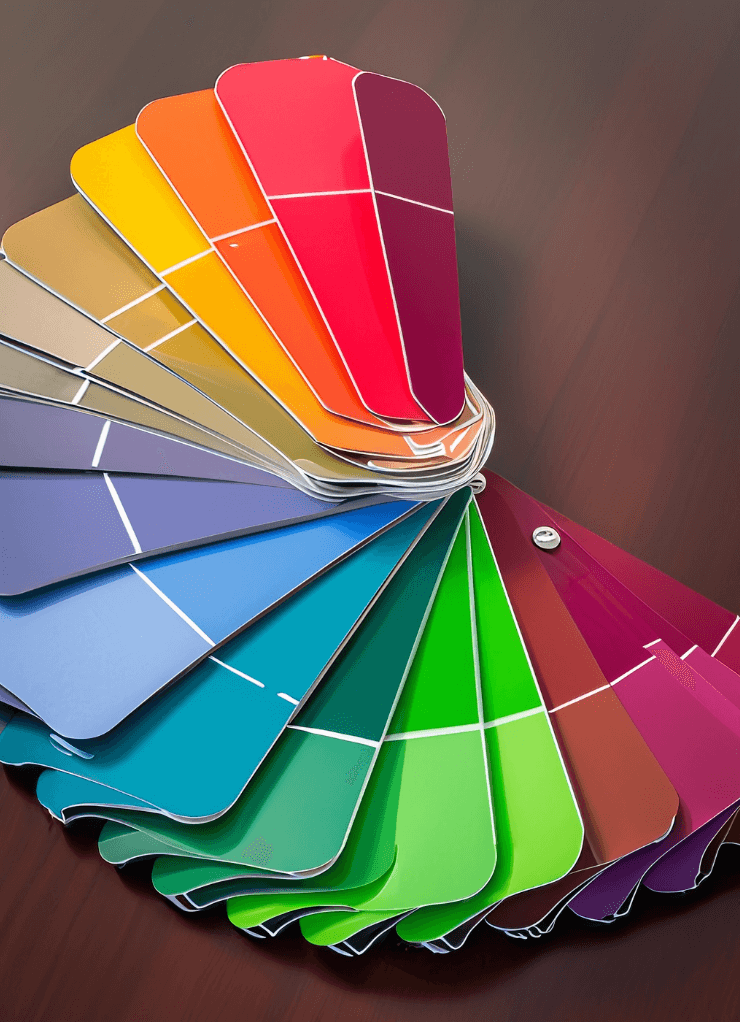
Now that we’ve covered the basics of color theory, let’s delve deeper into its most fundamental tool: the color wheel. Picture a wheel in your mind, filled with a vibrant spectrum of colors. This, my friend, is the color wheel, and it’s been a trusted companion of artists and designers for centuries.
The color wheel was first developed by Sir Isaac Newton in the late 17th century. Yes, the same Newton who discovered gravity also found time to map the color spectrum into a circle. The wheel starts with the three primary colors: red, yellow, and blue. By mixing these primary colors, we get the secondary colors: green, orange, and purple. Mix a primary color with a secondary color, and you get a tertiary color. This gives us a full spectrum of colors, all neatly arranged in a circle.
But how do we use this in interior design? Let’s say you’re choosing a color scheme for your bedroom. You want it to be relaxing, so you start with a cool blue. Now, using the color wheel, you can easily find colors that will complement your blue. For a harmonious look, you could choose green or purple, which are analogous to blue. Or, for a bit of contrast, you could choose orange, which is directly opposite blue on the color wheel.
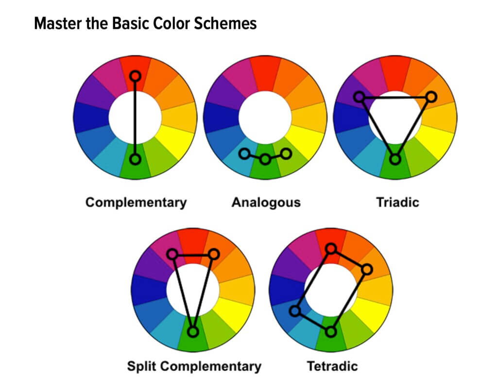
The color wheel also helps us understand color relationships. For instance, colors that are close together on the wheel are analogous and create a serene and comfortable design. Colors that are opposite each other on the wheel are complementary and provide a vibrant and energetic look.
So, the next time you’re choosing colors for a room, remember the color wheel. It’s not just a pretty circle of colors; it’s a powerful tool that can help you create a balanced, harmonious design. And who knows? With a bit of practice, you might just find yourself seeing the world through a designer’s eyes!
Beyond the Basics: Modern Color Theory and Digital Design
Alright, we’ve mastered the basics, so now it’s time to step into the modern era of color theory. In today’s digital world, we often encounter two other color models: RGB and CMYK. If you’ve ever dabbled in digital design or photography, these acronyms might sound familiar. But what do they mean, and how do they relate to our trusty color wheel?
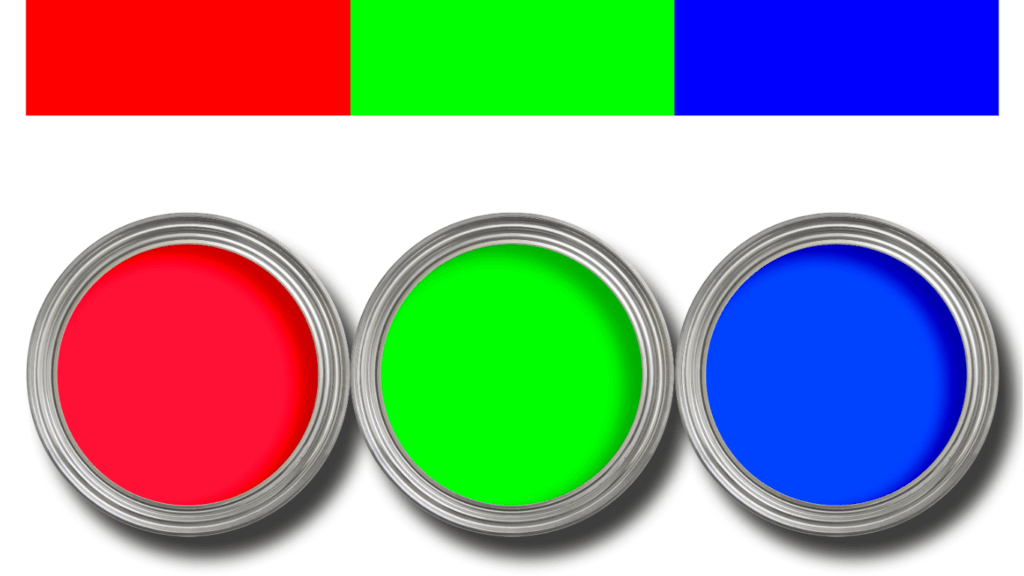
RGB stands for Red, Green, and Blue, the primary colors of light. When these colors are combined, they can create any color on the spectrum. This model is used in digital design because it’s how our screens display color. So, if you’re designing a digital space or choosing colors for a website, you’ll likely be working with the RGB model.
On the other hand, CMYK stands for Cyan, Magenta, Yellow, and Key (or black). This model is used in print design. It’s called a subtractive model because the more color you add, the closer you get to black. So, if you’re choosing colors for a printed brochure or a paint color for your walls, you might be working with the CMYK model.
But how do these models relate to the traditional RYB (Red, Yellow, Blue) color wheel we discussed earlier? Well, they’re just different ways of understanding and manipulating color. The RYB model is based on paint and pigments, making it perfect for artists and interior designers. The RGB and CMYK models, on the other hand, are based on light and ink, making them ideal for digital and print design.
So, whether you’re painting a room, designing a website, or printing a brochure, understanding these color models can help you make informed design decisions. Remember, color is a powerful tool, and the more we understand it, the more effectively we can use it to create beautiful, impactful designs. So keep exploring, keep learning, and most importantly, have fun with it!
Exploring Tints, Shades, and Tones
Fantastic! Now that we’ve got a handle on the color wheel and the different color models, let’s dive even deeper. We’re going to explore the world of tints, shades, and tones. These are variations of colors that can dramatically affect the mood and feel of your design.
Let’s start with tints. A tint is created when you add white to a color. This lightens the color, often resulting in a softer, more delicate version. Picture a sky-blue wall in a nursery or a pastel pink throw pillow on a couch. These are examples of tints, and they can create a light, airy feel in a room.
Next, we have shades. A shade is created when you add black to a color. This darkens the color, making it more intense and often more dramatic. Imagine a deep burgundy accent wall or a navy blue rug. These are examples of shades, and they can add depth and richness to a design.
Finally, we have tones. A tone is created when you add gray to a color. This reduces the color’s intensity, often making it more subdued and sophisticated. Think of a muted olive green sofa or a toned-down coral bedspread. These are examples of tones, and they can create a calm, relaxed feel in a room.
Understanding tints, shades, and tones can take your design skills to the next level. It allows you to manipulate colors to create the exact mood and feel you want in a room. So, the next time you’re choosing a color, don’t just think about the hue. Consider whether a tint, shade, or tone might better suit your design goals. Remember, the world of color is vast and exciting, so don’t be afraid to experiment and have fun with it!
The Magic of Complementary Colors
Now, let’s get to the heart of the matter: the magic of complementary colors. Remember when we talked about the color wheel? Complementary colors are the ones that sit directly opposite each other on that wheel. They might seem like unlikely pairs, but when they come together, they create a vibrant, high-contrast look that’s truly captivating.
Why does this happen? It’s all about how our eyes perceive color. When we see a color, our eyes naturally seek out its complement to provide balance and harmony. So, when we pair complementary colors together, it creates a dynamic tension that’s visually exciting and appealing.
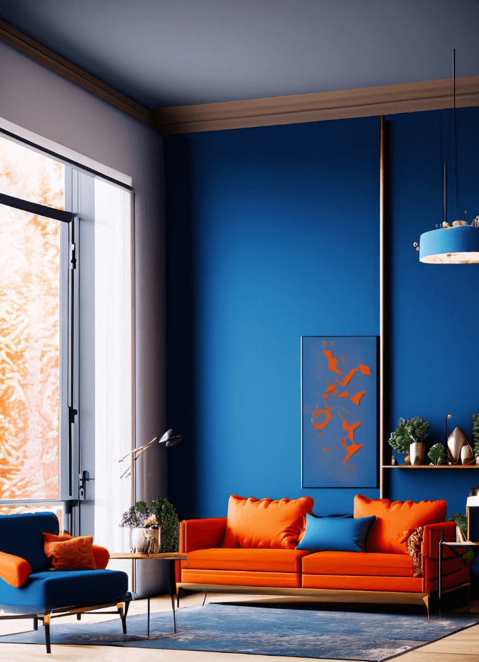
Let’s take a look at some real-world examples. Picture a room with a deep blue wall and bright orange accents in the form of throw pillows and wall art. The blue and orange are complementary colors, and their high contrast creates a lively, energetic space that’s full of personality.
Or, imagine a soft lavender bedroom with accents of light green in the bedding and curtains. The lavender and green are complements, and their combination creates a soothing, tranquil space that’s perfect for relaxation.
But the magic of complementary colors isn’t just for bold, high-contrast designs. You can also use tints, shades, and tones of complementary colors to create more subtle, sophisticated looks. For example, a room with walls painted in a toned-down coral and furniture in a muted teal can be just as captivating.
So, whether you’re a fan of bold, vibrant designs or prefer something more subdued, don’t underestimate the power of complementary colors. They can bring balance, energy, and a touch of magic to any space. So go ahead, play around with different combinations, and let the magic of complementary colors transform your interior designs!
Expanding Your Palette: Other Color Schemes to Consider
While complementary colors are a fantastic tool in interior design, they’re just one of many color schemes at your disposal. Let’s broaden our horizons and delve into other popular schemes: monochromatic, analogous, and split-complementary.
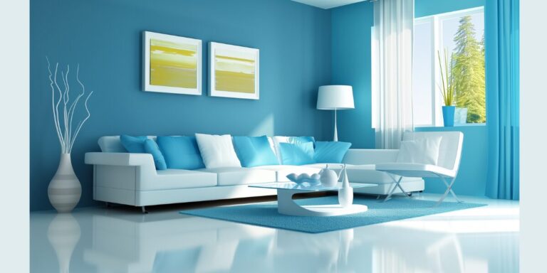
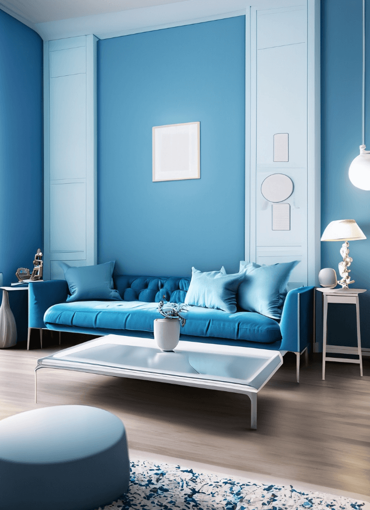
A monochromatic color scheme, as the name suggests, revolves around a single color. But it’s far from monotonous! By incorporating different tints, shades, and tones of the chosen color, you can create a space that’s harmonious and visually interesting. Imagine a room with walls painted in a soft sky blue, a mid-blue sofa, and dark blue curtains. The result? A tranquil, cohesive space that’s soothing to the eye.
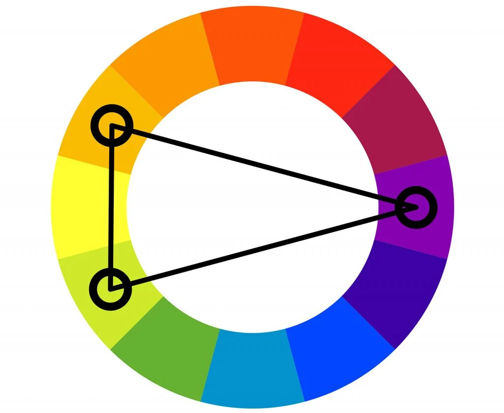
Next up, we have the analogous color scheme, which involves using colors that sit side by side on the color wheel. This scheme creates a vibrant yet harmonious look, perfect for those who love color but prefer a more unified feel. Picture a living room with a sunny yellow wall, a soft peach sofa, and throw pillows in a warm coral. The result is a room that’s full of energy and warmth, yet still feels balanced and cohesive.
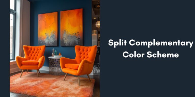
But what if you love the contrast of a complementary scheme but crave a bit more harmony? Enter the split-complementary scheme. This involves choosing a base color and pairing it with the two colors adjacent to its direct complement on the color wheel. For instance, if you choose blue as your base color, instead of pairing it with its direct complement, orange, you’d opt for red-orange and yellow-orange. This results in a room that’s vibrant and visually exciting, yet still retains a sense of balance and harmony.
Remember, the beauty of interior design lies in its flexibility. Whether you opt for a complementary, monochromatic, analogous, or split-complementary scheme, the key is to choose what resonates with you and the mood you want to create in your space. Don’t be afraid to experiment, have fun with it, and most importantly, let your unique style shine through! After all, the best interior design is the one that feels like home to you.
The Emotional Impact of Color: Understanding Color Psychology
Now, let’s delve into a fascinating aspect of color that often goes unnoticed: its psychological impact. Colors are not just visually appealing; they can also evoke a wide range of emotions and influence our mood. This is known as color psychology, and understanding it can take your interior design skills to a whole new level.
Each color has its own psychological value. For instance, red is often associated with passion and energy, making it a great choice for spaces where you want to stimulate activity, like a kitchen or a workout room. On the other hand, blue is linked with calmness and serenity, making it perfect for creating a relaxing atmosphere in bedrooms or bathrooms.
Yellow, being the color of sunshine, is associated with happiness and optimism. It can be a great choice for communal spaces like living rooms or kitchens, where it can help create a bright, cheerful mood. Green, reminiscent of nature, is often linked with tranquility and health, making it a soothing choice for virtually any room.
But how can we use color psychology in interior design? The key is to consider the mood you want to create in each room. If you want a relaxing bedroom, you might opt for blues or greens. If you want an energizing workout room, you might choose reds or oranges.
Remember, these are general guidelines, and the emotional impact of color can vary from person to person. It’s important to choose colors that resonate with you personally. After all, you’re the one who will be living in the space!
So, the next time you’re choosing colors for a room, don’t just think about how they look. Consider how they make you feel. By understanding and utilizing color psychology, you can create spaces that are not just beautiful, but also emotionally satisfying. And that, my friend, is the true power of color in interior design.
Putting Theory into Practice: Using Complementary Colors in Your Space
Now that we’ve explored the theory behind color and its psychological impact, it’s time to put that knowledge into practice. Let’s walk through a step-by-step guide on how to use complementary colors in your interior design.
Step 1: Choose Your Base Color Start by choosing a base color. This could be a color you love, a color that suits the mood you want to create, or even a color that matches a key piece of furniture or artwork in your room.
Step 2: Find Its Complement Once you’ve chosen your base color, refer to the color wheel to find its complement. Remember, the complement is the color directly opposite your base color on the wheel.
Step 3: Decide on the Balance Next, decide on the balance between your base color and its complement. Do you want a 50/50 split for a bold, high-contrast look? Or would you prefer a more subtle look with a 70/30 or 80/20 split?
Step 4: Consider Tints, Shades, and Tones Remember, you don’t have to stick to the pure hues. Consider using tints, shades, and tones of your chosen colors to add depth and interest to your design.
Step 5: Test Your Colors Before you commit, test your colors in the room. Paint swatches on the wall, look at them at different times of the day and under different lighting conditions. Make sure you’re happy with your choices in all scenarios.
Now, let’s look at a real-world example. Consider a living room that features a deep, navy blue sofa as the centerpiece. The complement to navy blue is a rich, burnt orange. To create a balanced look, you could incorporate this orange in the form of throw pillows on the sofa, a rug under the coffee table, or artwork on the walls. To add depth, you could use lighter tints of blue for the walls and darker shades of orange for additional accent pieces.
Remember, the goal is to create a space that reflects your personal style and meets your needs. So, don’t be afraid to experiment, play around with different hues and balances, and most importantly, have fun with it! After all, interior design is as much an art as it is a science.
Conclusion
And there you have it! We’ve journeyed through the vibrant world of color, exploring everything from the basics of color theory to the psychological impact of different hues. We’ve delved into the color wheel, discovered the magic of complementary colors, and even explored other color schemes like monochromatic, analogous, and split-complementary.
We’ve learned that color is more than just a visual element; it’s a powerful design tool that can transform a space, evoke emotions, and even influence our thoughts and behaviors. We’ve seen how understanding and effectively using color can help us create spaces that are not just beautiful, but also harmonious, balanced, and emotionally satisfying.
But remember, all this knowledge is just a starting point. The true magic happens when you start applying it to your own space. So, why not give it a try? Choose a room in your home, pick a color scheme, and start experimenting. Play around with different hues, tints, shades, and tones. Test your colors, adjust your balances, and don’t be afraid to make changes until you find the perfect fit.
Interior design is a journey, and every journey begins with a single step. So, take that step, embrace the power of color, and start creating spaces that truly feel like home. After all, the best interior design is the one that reflects your unique style and personality. So go ahead, unlock the power of complementary colors, and let your creativity shine!
FAQs
What are complementary colors in interior design?
Complementary colors are pairs of colors that are opposite each other on the color wheel. When used together in a design, they create a vibrant contrast, making each color stand out.
How can I use the color wheel in my home decor?
The color wheel is a valuable tool in interior design. It can help you understand color relationships and choose color schemes for your rooms. For example, you can use it to find complementary colors, analogous colors, or split-complementary colors for a harmonious design.
What is color psychology and how does it affect interior design?
Color psychology is the study of how colors can influence our emotions and behaviors. In interior design, understanding color psychology can help you create spaces that evoke desired feelings. For example, blues and greens are often used to create calming spaces, while reds and oranges can create energizing environments.
What are some other color schemes besides complementary?
Besides complementary, other common color schemes include monochromatic (using different shades, tints, and tones of one color), analogous (using colors that are next to each other on the color wheel), and split-complementary (using a base color and the two colors adjacent to its complement).
How can I apply color theory to my own home?
Start by considering the mood you want to create in each room. Then, use the color wheel to help you choose a color scheme that will evoke those feelings. Remember to consider the balance of colors, and don’t be afraid to experiment with different hues, tints, shades, and tones.
Help us spread the word by sharing this post with your friends and Follow us for more exciting content!
Inside Decors
Team: Inside DecorsInside Decors is your trusted source for expert interior design advice, home decor inspiration, and practical decorating solutions. Our team comprises highly skilled and experienced interior designers who are passionate about transforming spaces into beautiful, functional homes.
With a commitment to excellence and a dedication to continuous learning, our designers hold various industry certifications and regularly update their knowledge to stay ahead of the latest trends and innovations in the field. This ensures that the advice and inspiration we provide are not only current but also grounded in professional expertise.
Our content spans a wide range of topics, from interior design principles and the latest trends to practical DIY projects and budget-friendly decorating tips. Whether you’re looking to revamp a single room or redesign your entire home, Inside Decors is your go-to resource.
When you read our guides, you can trust that you’re receiving advice from industry experts who are committed to helping you create the home of your dreams. We believe that everyone deserves a beautiful, comfortable home, and we’re here to provide the knowledge and tools you need to make that a reality.
Thank you for choosing Inside Decors. We look forward to helping you transform your space into a home that truly reflects your personality and style.

