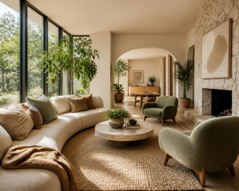

By Inside Decors · Updated January 15, 2026
Affiliate Disclosure: This article contains affiliate links. If you make a purchase through these links, we may earn a small commission at no additional cost to you.
Key Takeaways
- Color coordination is foundational: Use the 60-30-10 rule to balance throw blankets with pillows, rugs, and curtains for a cohesive look
- Texture layering adds depth: Combine 2-3 different textures (chunky knits, velvet, linen) to create visual interest without overwhelming the space
- Pattern mixing requires strategy: Vary pattern scales and stick to a shared color palette—pair large florals with small geometrics for balance
- Placement matters as much as selection: Strategic draping on sofas, chairs, and unexpected surfaces transforms blankets from functional items to design elements
- Budget-friendly impact: Throw blankets offer one of the highest ROI accessories for refreshing a room, typically $25-150 per piece
Creating a Cohesive Home Decor Through Intentional Coordination

A well-designed home isn’t about filling rooms with expensive furniture—it’s about creating harmony between every element, from the largest sofa to the smallest decorative accent. Throw blankets serve as the perfect bridge between function and style, offering warmth while tying together your room’s color palette, texture story, and overall aesthetic.
After working with hundreds of clients on home refreshes, I’ve learned that coordinating throw blankets with other accessories—throw pillows, rugs, curtains, and artwork—is one of the most impactful yet underutilized design strategies. A $40 throw blanket positioned thoughtfully can make a $2,000 sofa look intentional, or conversely, a poorly chosen one can disrupt an otherwise beautiful space.
This comprehensive guide will walk you through the exact coordination techniques professional designers use, complete with specific color formulas, texture combinations, and placement strategies that work in real homes. Whether you’re working with a boho living room aesthetic or a minimalist modern space, these principles will help you create a cohesive, magazine-worthy look.
Understanding the Foundation: The 60-30-10 Color Rule for Throw Blankets

Before selecting any throw blanket, you need to understand where it fits in your room’s color hierarchy. The 60-30-10 decorating rule provides the perfect framework:
- 60% Dominant color: Your walls, large furniture pieces, and primary rug
- 30% Secondary color: Curtains, accent chairs, secondary upholstery
- 10% Accent color: Throw pillows, artwork, decorative objects—and throw blankets
Most throw blankets should fall into either the 30% or 10% category. A neutral blanket (cream, gray, beige) works as part of your 30% secondary palette, while a bold jewel-tone or patterned throw serves as a 10% accent piece.
Practical example: In a living room with light gray walls (60%), a navy sofa (30%), and gold accent pillows (10%), you could choose either a textured gray throw to reinforce the secondary color, or a gold-and-navy patterned throw to bridge both accent and secondary colors.
Pairing Throw Blankets with Throw Pillows: The Designer’s Formula

The throw blanket and pillow combination is where most coordination happens—and where most mistakes occur. Here’s the systematic approach that works consistently:
The Three-Layer Pillow and Blanket Strategy
Layer 1 (Foundation): Two large solid pillows (22″ or 24″) in your secondary color
Layer 2 (Pattern): Two medium pillows (20″) in a patterned fabric that incorporates both your secondary and accent colors
Layer 3 (Accent): One small pillow (18″) in your boldest accent color or texture
Blanket: Draped to show 12-18 inches of fabric, coordinating with either Layer 2 or Layer 3
This creates visual depth without chaos. The blanket should share at least one color with your pillow arrangement but introduce a different texture or pattern scale.
Balancing Colors, Patterns, and Textures
Color coordination strategies:
- Monochromatic harmony: Choose blankets and pillows in varying shades of the same color family (light gray blanket, charcoal pillows, silver accents)
- Analogous pairing: Select colors next to each other on the color wheel (blue-green blanket with teal and navy pillows)
- Complementary contrast: Use opposite color wheel positions sparingly (rust orange blanket with one teal accent pillow among neutral pillows)
- Neutral bridge: When in doubt, use a neutral blanket to connect two bolder pillow colors
Pattern mixing guidelines:
The key to successful pattern mixing is varying scale while maintaining color consistency. Here’s a proven formula:
- Large-scale pattern (6″+ repeat): Oversized florals, bold geometrics, large plaids—use on one pillow maximum
- Medium-scale pattern (2-6″ repeat): Standard florals, medium stripes, classic ikat—use on 1-2 pillows
- Small-scale pattern (under 2″ repeat): Mini dots, fine stripes, small geometrics—use on blanket or 1-2 pillows
- Solid/texture: Always include at least 40% solid or textured-but-not-patterned elements
Real-world example: Pair a chunky cable-knit cream throw blanket with a large-scale navy floral pillow (20″), two medium-scale cream-and-navy striped pillows (18″), and one solid navy velvet pillow (22″). The blanket’s texture counts as visual interest without adding pattern competition.
Texture layering combinations that work:
- Smooth velvet pillows + chunky knit throw
- Linen pillows + faux fur throw
- Silk pillows + waffle-weave cotton throw
- Leather pillows + wool throw
- Cotton canvas pillows + cable-knit throw
Avoid pairing similar textures (velvet with velvet, knit with knit) unless they’re in contrasting colors—the similarity creates visual flatness rather than interest.
Shopping Recommendations
For coordinated pillow and blanket sets, consider these options:
- Textured throw blankets: Search chunky knit throw blankets on Amazon ($35-80 range)
- Velvet accent pillows: Search velvet throw pillow covers on Amazon ($12-30 per cover)
- Patterned decorative pillows: Search geometric pattern throw pillows on Amazon ($18-45 each)
Coordinating Throw Blankets with Rugs and Curtains
While pillows get most of the coordination attention, the relationship between your throw blanket, area rug, and window treatments creates the room’s overall cohesion.
The Rug-Blanket Connection
Your area rug typically contains 3-5 colors. Your throw blanket should pull one of the secondary colors from the rug—not the dominant color (which would be redundant) and not a color absent from the rug (which would feel disconnected).
Practical application: If your rug features cream (dominant), navy (secondary), rust (accent), and gold (accent), choose a throw blanket in either navy with texture, rust with a subtle pattern, or a cream-and-navy combination. Avoid introducing a new color like emerald green unless it appears elsewhere in the room.
Texture consideration: If your rug is high-pile or shag, balance it with a smoother throw blanket (cotton, linen, lightweight knit). If your rug is flat-weave or low-pile, you can use a chunkier, more textured throw for contrast.
The Curtain-Blanket Relationship
Curtains and throw blankets should feel related but not matchy-matchy. Here’s the hierarchy:
If curtains are patterned: Choose a solid or subtly textured throw in one of the curtain’s colors
If curtains are solid: You have freedom to use either patterned or textured throws, as long as the color coordinates
If curtains are neutral: Use your throw blanket as an opportunity to introduce your accent color
Weight and formality matching: Heavyweight linen curtains pair well with substantial wool or cotton throws. Lightweight sheer curtains balance better with gauzy cotton or lightweight knit throws. Velvet curtains call for luxe throws like faux fur, chenille, or cashmere blends.
Creating Visual Flow Between Elements
The professional trick is creating a “color journey” around the room. Your eye should be able to travel from rug to throw blanket to curtains to artwork without jarring color jumps.
Example color journey: Cream rug with navy border → navy throw blanket with cream fringe → cream curtains with navy trim → navy and cream abstract artwork. Each element shares colors with its neighbors, creating seamless flow.
For rug shopping that coordinates with throw blankets:
– Area rugs with multiple colors: Search geometric area rugs on Amazon ($80-300 depending on size)
Styling Throw Blankets on Different Seating Arrangements
Placement technique matters as much as color selection. The same blanket can look elegant or sloppy depending on how it’s arranged.
Sofa Styling Techniques
The Casual Drape (best for family rooms):
Fold the blanket lengthwise into thirds, drape over one sofa arm, allowing 8-12 inches to puddle onto the seat. This signals “comfortable and lived-in” while maintaining intentionality.
The Structured Fold (best for formal living rooms):
Fold the blanket into a neat rectangle (approximately 18″ x 24″), place it on the seat cushion or draped evenly over the sofa back. This works particularly well with interior design styles that emphasize clean lines.
The Layered Corner (best for sectionals):
Place the blanket in the corner of a sectional, folded loosely and layered with pillows. This creates a designated “cozy corner” that invites use.
Armchair and Accent Chair Placement
Chairs require different proportions than sofas:
For wingback and club chairs: Drape a 50″ x 60″ throw over one arm, allowing it to cascade down the side. The blanket should cover about one-third of the chair’s width.
For accent chairs without arms: Fold the blanket and place it across the back of the chair, with about 6 inches hanging over each side. Secure with a decorative ribbon or let it drape naturally.
For dining chairs (unexpected but effective): During colder months, drape lightweight throws over dining chair backs for a cozy, European bistro feel. Use throws in the 40″ x 50″ range to avoid overwhelming the chair.
Bench and Window Seat Styling
Storage bench styling: Fold a throw blanket into a runner shape (approximately 16″ wide) and lay it lengthwise along the bench. This adds softness while keeping the blanket accessible.
Window seat layering: Layer 2-3 pillows against the wall, then fold a throw blanket and place it on the seat portion. The blanket serves as both cushioning and decoration. Choose a throw that complements your window treatment fabric.
Outdoor Furniture Considerations
For covered patios and screened porches, throw blankets extend the usability of outdoor spaces:
- Choose solution-dyed acrylic or outdoor-rated polyester throws that resist fading and mildew
- Stick to darker colors (navy, charcoal, forest green) that hide inevitable outdoor dirt
- Store in a decorative basket when not in use—both practical and stylish
- Price range: $30-70 for weather-resistant throws
Search outdoor throw blankets on Amazon for weather-appropriate options.
Coordinating Throw Blankets with Artwork and Wall Decor
The wall-to-textile connection is often overlooked but creates powerful cohesion.
Pulling Colors from Artwork
Your artwork should inform your throw blanket selection, not the other way around (since artwork is typically more permanent and expensive).
The extraction method: Identify the 3-4 main colors in your primary artwork piece. Your throw blanket should feature the second or third most prominent color—not the dominant color, which would feel heavy-handed.
Example: In a living room featuring abstract art with cream (dominant), terracotta (secondary), and sage green (accent), choose a terracotta throw with cream details, or a sage green throw with terracotta fringe.
Creating Cohesion with Gallery Walls
If you have a gallery wall, your throw blanket can serve as a grounding element that ties together disparate frame colors and art styles:
- Black frames: Pair with charcoal, navy, or black-and-white patterned throws
- Gold frames: Coordinate with warm-toned throws (camel, rust, mustard, cream)
- White frames: Nearly any throw color works; use this as an opportunity for your boldest accent color
- Mixed frame colors: Choose a neutral throw (gray, beige, cream) that doesn’t compete
Texture Echoing
Create subtle sophistication by echoing textures between wall decor and textiles:
- Macramé wall hanging → chunky knit or fringed throw blanket
- Metal wall art → silk or satin-finish throw
- Woven basket wall decor → textured linen or cotton throw
- Smooth canvas prints → velvet or smooth cotton throw
Comparison: Throw Blanket Coordination Strategies by Design Style
| Design Style | Recommended Blanket Colors | Texture Preferences | Pattern Guidelines | Coordination Priority |
|---|---|---|---|---|
| Modern Minimalist | Monochromatic (gray, white, black, camel) | Smooth cotton, lightweight knit, cashmere blend | Solid or subtle texture only | Match curtains, contrast with one accent pillow |
| Boho/Eclectic | Warm earth tones, jewel tones, mixed | Chunky knit, fringe, tassels, macramé | Mix multiple patterns freely | Pull from rug colors, layer with patterned pillows |
| Coastal | White, navy, aqua, sand, coral | Lightweight cotton, linen, cable knit | Stripes, subtle nautical patterns | Coordinate with natural fiber rugs |
| Farmhouse | Cream, gray, muted blue, plaid | Chunky knit, cotton, buffalo check | Plaids, checks, simple stripes | Match wood tones, coordinate with shiplap or neutral walls |
| Traditional | Rich jewel tones, burgundy, navy, gold | Velvet, chenille, jacquard | Damask, florals, classic patterns | Formal coordination with curtains and upholstery |
| Scandinavian | White, light gray, soft pastels | Merino wool, cotton, simple knits | Solid or minimal geometric | Coordinate with light wood furniture, minimal pattern |
| Industrial | Charcoal, rust, olive, leather tones | Rough cotton, wool, distressed textures | Solid or subtle geometric | Contrast with metal elements, soften hard surfaces |
Unexpected and Creative Ways to Use Throw Blankets
Beyond traditional sofa draping, throw blankets can solve design challenges throughout your home.
Bedroom Applications
Bed scarf alternative: Instead of a traditional bed scarf, fold a throw blanket lengthwise and drape it across the foot of the bed at a slight diagonal. This works especially well on king and queen beds where a standard throw (50″ x 60″) creates interesting asymmetry.
Headboard softening: For upholstered headboards, drape a lightweight throw over the top edge, allowing 8-10 inches to show. This adds texture and can hide minor headboard wear.
Bench styling: Place a folded throw on a bedroom bench with coordinating pillows. This creates a cohesive look while keeping an extra blanket accessible.
Dining and Kitchen Spaces
Table runner substitute: For casual dining or breakfast nooks, use a throw blanket as a textured table runner. Choose tightly woven cotton or linen throws (not chunky knits) and fold to 14-16″ width. This works beautifully for making your home feel homey during fall and winter months.
Chair back warmth: In eat-in kitchens or breakfast nooks, drape lightweight throws over chair backs during colder months. Choose machine-washable options in darker colors.
Wall Decor Solutions
Textile wall hanging: Lightweight throws with interesting patterns or textures can be mounted on decorative rods as wall art. This works particularly well for:
– Vintage quilts or blankets with sentimental value
– Handwoven or artisan throws
– Bold geometric patterns that complement your color scheme
Use a rod 4-6 inches wider than the blanket, mounted 6-8 inches below the ceiling for maximum impact.
Temporary headboard: In rentals or temporary spaces, hang a throw blanket on the wall behind your bed using a curtain rod. Choose a blanket 10-20 inches wider than your mattress.
Concealing and Problem-Solving
Furniture flaw coverage: A strategically placed throw can hide stains, tears, or wear on furniture you’re not ready to replace. Tuck the blanket firmly into cushion crevices and smooth for a tailored look.
Pet-friendly protection: Designate specific throws for pet areas, choosing durable, machine-washable options in colors that hide fur (medium gray for most pets). Search pet-friendly throw blankets on Amazon ($25-55 range).
Storage basket filler: In empty decorative baskets, fold 2-3 coordinating throws and display them rolled or folded. This solves both storage and styling needs.
Seasonal Rotation Strategy
Professional designers rotate throws seasonally to refresh spaces without major investment:
Spring/Summer: Lightweight cotton, linen, or gauze throws in whites, soft blues, corals, and greens ($30-60)
Fall/Winter: Chunky knits, faux fur, wool blends in deeper tones, plaids, and rich textures ($45-120)
Store off-season throws in vacuum bags or cedar chests to maintain quality and save space.
Budget-Conscious Coordination: Maximum Impact for Minimum Investment
Throw blankets offer exceptional ROI for home styling. Here’s how to maximize impact on any budget:
The $100 Room Refresh
With $100, you can transform a living room’s entire feel:
– One quality throw blanket: $40-50
– Two coordinating pillow covers: $15-20 each
– One small accent item (candle, vase, or small artwork): $15-20
This combination, carefully coordinated using the principles above, creates more impact than a single $100 furniture piece.
Thrift and Vintage Coordination
Thrifted throws can be design gold if you know what to look for:
– Inspect for: Pilling, stains, odors, and fabric integrity
– Best finds: Wool blankets, vintage quilts, handwoven textiles
– Cleaning: Always dry clean or hot-wash vintage textiles before use
– Coordination: Vintage pieces work best as the “anchor” item—build your pillow and accessory colors around them
DIY Customization
Transform affordable throws into custom pieces:
– Add tassel trim or fringe to plain blankets ($8-15 for supplies)
– Dye white or cream throws to match your exact color scheme
– Sew coordinating fabric strips to blanket edges for a designer look
Search fabric trim and tassels on Amazon for customization supplies ($10-25).
Common Coordination Mistakes and How to Fix Them
Mistake 1: Too Much Matching
The problem: Everything matches perfectly—same color pillows, blanket, and curtains.
The fix: Keep two elements coordinated, make the third contrast. If pillows and curtains are navy, choose a cream or patterned blanket with navy accents.
Mistake 2: Competing Patterns
The problem: Large-scale floral pillows + large-scale geometric blanket + busy patterned rug.
The fix: Follow the scale variation rule—one large pattern, one medium, one small, and one solid/texture.
Mistake 3: Texture Monotony
The problem: All smooth fabrics or all chunky knits.
The fix: Combine at least two different texture categories in every seating arrangement.
Mistake 4: Wrong Proportions
The problem: Tiny throw on a large sectional, or oversized blanket overwhelming a small chair.
The fix: Use 50″ x 60″ throws for standard sofas and chairs, 60″ x 80″ for sectionals and oversized furniture, 40″ x 50″ for accent chairs.
Mistake 5: Ignoring Undertones
The problem: Warm-toned beige blanket with cool-toned gray pillows—they “fight” each other.
The fix: Match undertones. Pair warm beiges with warm grays (greige), or cool beiges with true cool grays. When in doubt, use pure white or black as a bridge.
Shop This Look
Editor-picked finds to bring this style home:
- Textured Knit Throw Pillow →Adds complementary softness and visual interest, echoing the blanket’s cozy texture.
- Ceramic Decorative Vase →Introduces a contrasting material, providing an anchor for the blanket’s color palette.
- Wooden Tray Coffee Table →Offers a practical surface, grounding the blanket and other accessories beautifully.
- Scented Candle Set →Creates an inviting ambiance, enhancing the comfort and style of the space.
As an Amazon Associate we earn from qualifying purchases.
Frequently Asked Questions
How many throw blankets should I have in one room?
For a living room, 2-3 throw blankets is the sweet spot. Place one on the main sofa, one on an accent chair or secondary seating, and optionally one in a decorative basket. More than three can look cluttered unless you have a very large space. In bedrooms, 1-2 throws (one at the foot of the bed, one on a chair or bench) is sufficient.
Should my throw blanket match my curtains or my pillows?
Your throw blanket should coordinate with both but match neither exactly. The ideal approach is to pull a secondary color from your curtains and echo a texture or pattern element from your pillows. For example, if you have solid navy curtains and patterned blue-and-cream pillows, choose a textured navy throw or a cream throw with navy details.
What’s the best throw blanket size for a standard sofa?
A 50″ x 60″ throw is the standard size for most sofas and provides enough coverage to drape attractively while remaining functional. For oversized sectionals, consider 60″ x 70″ or 60″ x 80″ throws. For accent chairs, 40″ x 50″ works better as larger sizes overwhelm the proportions.
How do I coordinate throw blankets in an open-concept space?
In open-concept homes, use throw blankets as a tool to create cohesion between zones. Select 2-3 coordinating colors that appear throughout the space, then use different textures of throws in those colors across different areas. For example, a chunky cream knit in the living area, a smooth cream cotton in the dining area, and a cream-and-navy pattern in the reading nook creates unity through color while texture variation defines separate zones.
Can I mix warm and cool colors in my throw blanket coordination?
Yes, but use a neutral bridge color to prevent clashing. If you want to combine warm rust tones with cool navy, include cream, white, or gray elements that appear in both warm and cool zones. Alternatively, choose a throw blanket that contains both warm and cool colors in its pattern, which gives you permission to pull from both temperature families.
How often should I replace or rotate my throw blankets?
Quality throw blankets should last 3-5 years with regular use, longer if rotated seasonally. However, rotating throws seasonally (lightweight for spring/summer, heavier textures for fall/winter) keeps your space feeling fresh and extends the life of each blanket. Consider refreshing your throw blanket collection every 2-3 years to stay current with your evolving style and to replace any worn pieces.
Conclusion: Creating Your Coordinated Home Sanctuary
Coordinating throw blankets with your home’s other accessories isn’t about rigid rules—it’s about understanding the principles of color harmony, texture balance, and intentional placement, then adapting them to your unique space and style. The difference between a room that feels “decorated” and one that feels professionally designed often comes down to these thoughtful coordination details.
Start with one room and apply the 60-30-10 color rule, choose 2-3 complementary textures, vary your pattern scales, and place your throw blanket with intention rather than as an afterthought. As you develop your eye for coordination, you’ll find that these principles become second nature.
Remember that your home should reflect your personality and lifestyle. If you prefer bold pattern mixing, embrace it—just follow the scale variation guidelines. If you’re drawn to minimalist simplicity, let texture do the heavy lifting while keeping colors neutral. The goal is a space that feels both cohesive and authentically yours.
Ready to put these principles into action? Start by assessing your current throw blanket and pillow combination. Does it follow the color and texture guidelines outlined here? If not, identify one element to change—often a single new throw blanket in a coordinating color can transform your entire seating area. For more inspiration on creating a cohesive home aesthetic, explore our guide on the 7 principles of interior design.
Your beautifully coordinated, inviting home is just a few intentional choices away.