Hello there, design enthusiast! Isn’t it wonderful how our shared passion for interior design brings us together? Grab your cup of coffee, and let’s dive into a fascinating aspect of design that often goes unnoticed, yet plays a pivotal role in shaping our homes.
Picture this: you’re walking through a beautifully designed room, and you can’t quite put your finger on why it feels so harmonious. The furniture is eclectic, the colors are varied, yet everything seems to fit together perfectly. Then it hits you – it’s the repetition! That lovely floral pattern on the throw pillows is echoed subtly in the wallpaper, and the curve of the armchair mirrors the arch of the window. It’s these repeating elements that tie the room together, creating a sense of unity and rhythm.
This, my friend, is the magic of repetition in interior design. It’s like a quiet melody playing in the background of a song, not always noticed, but essential to the overall harmony. So, let’s embark on this journey together, exploring the art of repetition, and how it can transform our spaces from ordinary to extraordinary. Are you ready?
The Rhythm of Repetition: Why it Matters
When we think of interior design, our minds often leap to color palettes, furniture styles, and art pieces. But let’s take a moment to appreciate a less obvious, yet equally important aspect – repetition. It’s the secret ingredient that adds rhythm and harmony to a space, making it feel cohesive and well thought out.
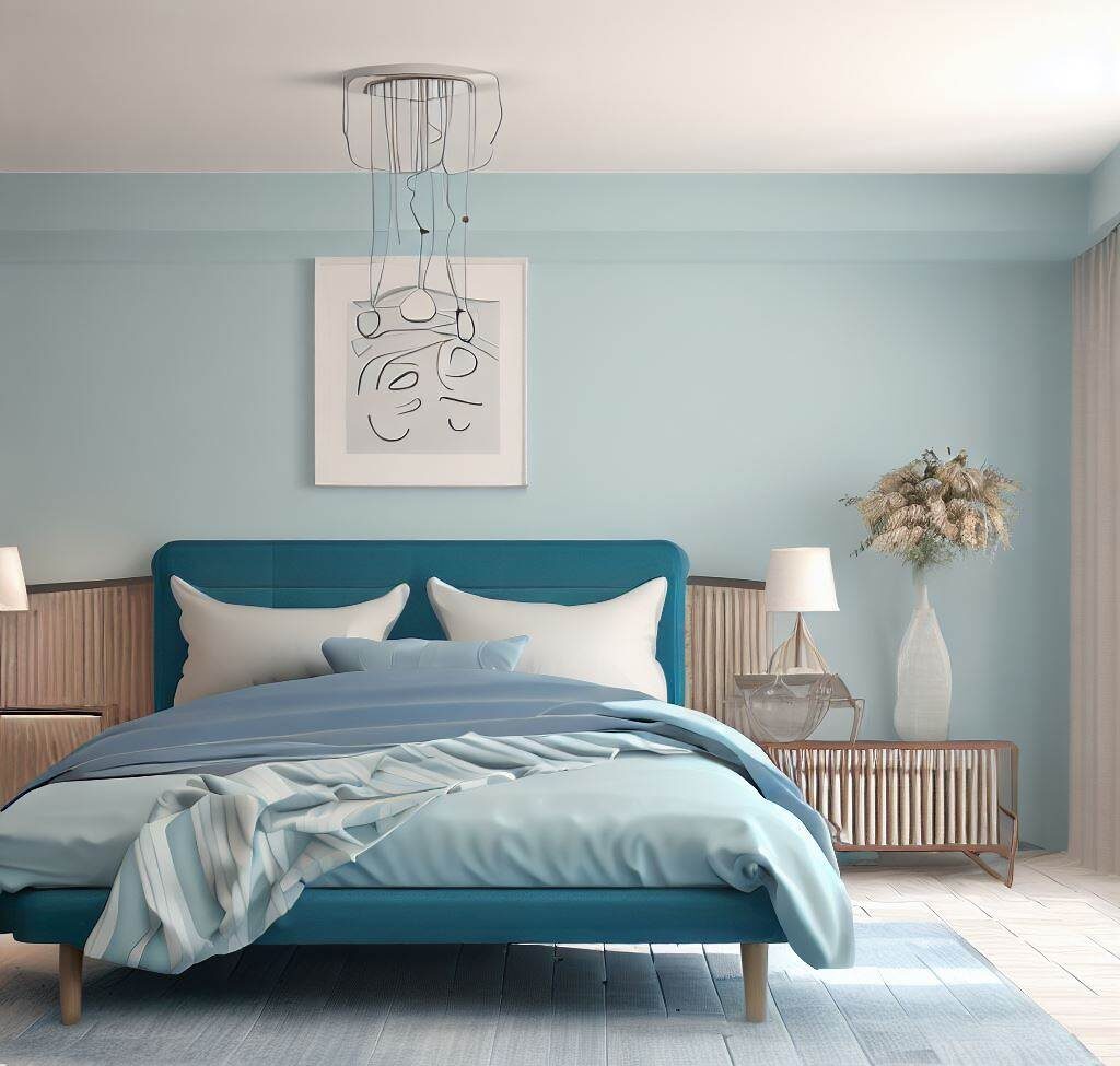
Repetition in interior design is all about creating visual interest and balance. It’s the repeated use of patterns, colors, shapes, or textures throughout a space. Think of a living room where the geometric pattern on the rug is echoed in the throw pillows, or a bedroom where the curve of the bed’s headboard is mirrored in the shape of the bedside tables. These repeating elements create a rhythm that guides the eye from one part of the room to another, creating a sense of unity and balance.
Let’s take a real-world example. Imagine a dining room with a long wooden table. Above it hangs a chandelier with multiple pendant lights, all of the same design. The chairs around the table, too, are identical. This repetition of shapes and materials creates a rhythm that makes the space feel harmonious and inviting. It’s like a visual echo that ties everything together.
But the impact of repetition goes beyond aesthetics. Psychologically, repetition creates a sense of comfort and familiarity. Our brains are wired to recognize patterns, and when we see repetition in a room, it feels inherently pleasing and calming. It’s a subtle way of saying, “You’re in a well-ordered space. Relax, you’re at home.”
Become a Professional Interior Designer
Ready to unleash your creativity and transform spaces? Enroll in The Interior Design Institute’s course today and start your journey to becoming a professional interior designer.
Patterns and Prints: The Backbone of Repetition
Let’s turn our attention to one of its most vibrant expressions: patterns and prints. These are the bold strokes on the canvas of interior design, the elements that can instantly inject personality and character into a space. And when used thoughtfully, they can be a powerful tool for creating repetition.
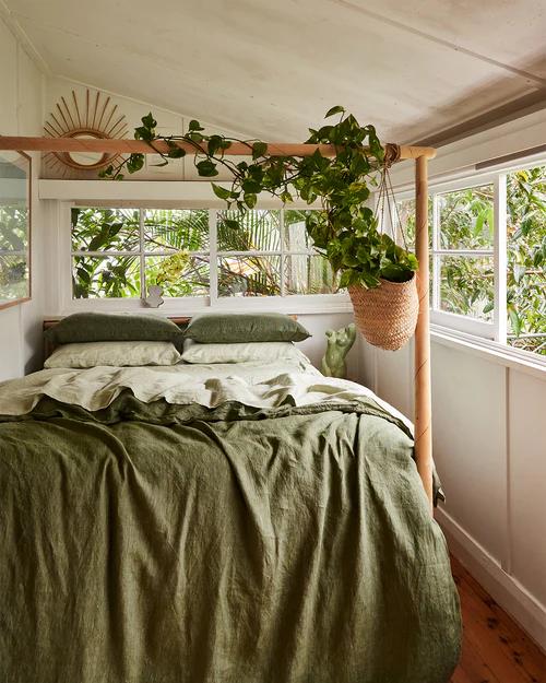
Consider a living room with a bold, geometric wallpaper. The same pattern is echoed in the cushions on the sofa, creating a visual link that ties the room together. Or imagine a bedroom with a floral bedspread, and the same flowers appearing subtly in the artwork on the walls. These repeating patterns create a rhythm, a sense of continuity that makes the space feel cohesive and well-designed.
But how do we choose and mix patterns effectively? Here are a few tips:
- Stick to a Color Palette: When mixing patterns, it helps to have a common color palette. This creates a sense of harmony, even if the patterns themselves are different.
- Vary the Scale: Mix large-scale patterns with smaller ones to create balance. If all your patterns are bold and large, the space can feel overwhelming. If they’re all small and delicate, it can feel too busy.
- Balance with Solids: Too many patterns can feel chaotic. Balance them out with solid colors to give the eye a place to rest.
- Trust Your Instincts: At the end of the day, your space should reflect your personal style. If you love a pattern, find a way to incorporate it. The best-designed spaces are the ones that feel authentic and personal.
So, don’t be afraid to play with patterns and prints. They’re not just decorative elements, but powerful tools for creating repetition and rhythm in your space.
Color Schemes: Repetition’s Best Friend
Now, let’s shift our focus to another crucial aspect of repetition: color schemes. The colors we choose for our spaces have a profound impact on the overall mood and feel. And when we use color repetition, we can create a sense of unity and harmony that’s truly transformative.
Imagine a room where the soft blue of the walls is echoed in the upholstery, the artwork, and even the decorative accents. Or a space where a bold pop of yellow is repeated in the throw pillows, the lampshade, and the rug. These repeating colors create a visual flow, guiding the eye from one element to another and making the space feel cohesive and intentional.
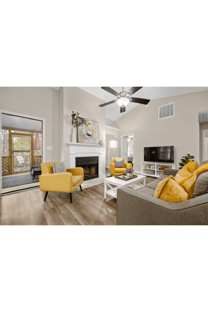
But how do we choose and repeat colors effectively? Here are a few tips:
- Choose a Dominant Color: This is the color that will be most prevalent in your space. It sets the overall mood, so choose a color that you love and that fits the vibe you’re going for.
- Pick Complementary Colors: These are the colors that will support your dominant color. They should be in harmony with the dominant color but can vary in intensity and tone.
- Repeat Colors in Different Ways: You can repeat your colors in the paint, the furniture, the textiles, the artwork, and even the smaller details like the vases or the picture frames. This creates a layered, nuanced look.
- Consider the Room’s Function and Lighting: A color that looks great in a sunny living room might not work as well in a dimly lit bedroom. Consider the function of the room and the lighting conditions when choosing your colors.
So, when you’re designing your next space, remember the power of color repetition. It’s not just about choosing beautiful colors, but also about repeating them in thoughtful ways to create a harmonious, cohesive design.
Shapes and Textures: The Subtle Side of Repetition
As we continue our exploration of repetition in interior design, let’s take a look into a subtler, yet equally impactful aspect: the repetition of shapes and textures. These elements might not be as immediately noticeable as patterns or colors, but they add a layer of depth and sophistication to a design that’s truly captivating.
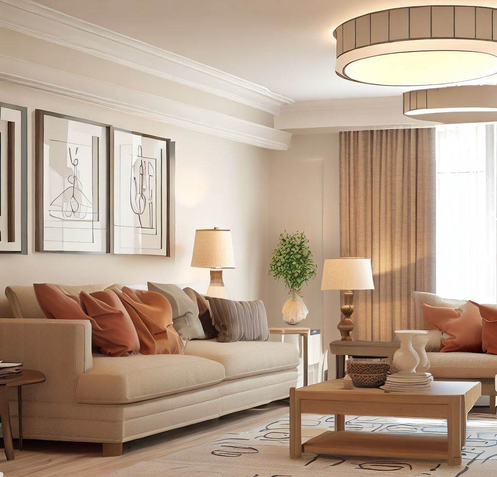
Consider a room where the rectangular shape of the coffee table is echoed in the bookshelves, the artwork, and even the rug. Or a space where the soft texture of a velvet sofa is repeated in the curtains and the throw pillows. These repeating shapes and textures create a sense of continuity and rhythm, adding depth and interest to the space.
But how do we incorporate this subtle form of repetition in our own spaces? Here are a few tips:
- Identify Key Shapes or Textures: Look at your space and identify any key shapes or textures. It could be the curve of your sofa, the rectangular shape of your rug, or the rough texture of your brick wall.
- Repeat These Elements: Once you’ve identified your key shapes or textures, find ways to repeat them. It could be in the form of a round mirror that echoes the curve of your sofa, or a brick-patterned rug that mirrors the texture of your wall.
- Balance is Key: Just like with patterns and colors, balance is crucial when repeating shapes and textures. Too much of the same shape can feel monotonous, while too many different shapes can feel chaotic. Aim for a balance that feels harmonious and pleasing to the eye.
- Experiment and Have Fun: The beauty of interior design lies in its capacity for personal expression. Don’t be afraid to experiment with different shapes and textures until you find a combination that feels right to you.
So, as you embark on your next design project, remember to pay attention to the subtler aspects of repetition. The shapes and textures you choose can add a layer of depth and sophistication to your design that’s truly unique and personal.
Repetition in Different Design Styles
As we continue look at repetition in interior design, let’s take a detour to explore how this principle is applied in different design styles. Whether it’s the clean lines of minimalism, the eclectic charm of bohemian, or the raw textures of industrial design, repetition plays a key role in defining and enhancing these unique aesthetics.
In a minimalist design, repetition often comes in the form of repeating lines and shapes. Think of a living room with a sleek, rectangular sofa, echoed by a similarly shaped coffee table and bookshelf. The repetition of these clean lines and simple shapes creates a sense of calm and order that’s characteristic of minimalist spaces.
In contrast, a bohemian style embraces a more eclectic approach to repetition. It might be a repeating pattern of vibrant colors and exotic prints, or a collection of similar objects, like vintage mirrors or ceramic vases, grouped together for visual impact. The repetition here adds to the rich, layered feel of bohemian interiors.
Industrial design, on the other hand, often uses repetition in its raw, textured materials. The repeated use of elements like exposed brick, weathered wood, or metal fixtures creates a sense of rugged charm and authenticity that’s central to the industrial aesthetic.
So, how can you incorporate repetition in these styles in a way that’s true to their unique aesthetics? Here are a few tips:
- Understand the Core Elements: Each design style has its core elements. For minimalism, it’s clean lines and simplicity. For bohemian, it’s eclectic patterns and vibrant colors. For industrial, it’s raw, textured materials. Identify these elements and think about how you can repeat them in your space.
- Be Mindful of Balance: While repetition is key, it’s also important to maintain balance. Too much repetition can make a space feel monotonous, while too little can make it feel disjointed. Aim for a balance that feels harmonious and true to the design style.
- Add Your Personal Touch: Remember, your space should reflect your personal style. Don’t be afraid to put your own spin on these design styles. The most beautiful spaces are the ones that feel authentic and personal.
So, as you explore different design styles, remember the role of repetition. It’s not just a design principle, but a tool for expressing the unique aesthetics of different styles.
Common Mistakes to Avoid with Repetition
. While repetition is a powerful tool for creating harmony and rhythm, it can also lead to design missteps if not used thoughtfully. Let’s explore some of these common mistakes and how to avoid them.
One common mistake is overdoing repetition. Imagine a room where every piece of furniture, every textile, every accessory is in the same color or pattern. Instead of creating harmony, this overuse of repetition can make the space feel monotonous and uninspiring. It’s like listening to a song where the same note is played over and over again – it quickly loses its charm.
Another mistake is using repetition without variation. Let’s say you have a floral pattern that you love, and you decide to repeat it in your wallpaper, your upholstery, and your curtains. But if the scale and color of the pattern are exactly the same in each application, the design can feel flat and uninteresting. It’s the variation in scale, color, and texture that adds depth and interest to repetition.
So, how can we avoid these mistakes and use repetition effectively? Here are a few tips:
- Balance Repetition with Variation: While repeating elements is key, it’s equally important to introduce some variation. This could be in the form of different scales, colors, or textures.
- Mix and Match: Don’t be afraid to mix different patterns, shapes, or colors. As long as they share some common elements, they can create a sense of repetition without feeling monotonous.
- Use Repetition Sparingly: Repetition is powerful, but it doesn’t need to be everywhere. Sometimes, a few well-placed repeating elements can have a greater impact than a room full of them.
Remember, the goal of repetition is to create a sense of harmony and rhythm, not to make everything look the same. So, as you experiment with repetition in your designs, keep these tips in mind to avoid common pitfalls and create spaces that are balanced, interesting, and uniquely yours.
Repetition and Contrast: A Dynamic Duo
As we near the end of our exploration of repetition in interior design, let’s turn our attention to a concept that goes hand in hand with repetition: contrast. While repetition creates a sense of harmony and unity, contrast adds interest and excitement, making our spaces not just pleasing to the eye, but truly engaging.
Contrast in interior design can come in many forms. It could be a contrast in color, like a bright red pillow on a neutral grey sofa. It could be a contrast in shape, like a round mirror above a rectangular console table. Or it could be a contrast in texture, like a soft, plush rug on a hard, wooden floor.
Now, imagine combining these contrasts with repetition. The red pillow is repeated in the artwork on the wall, creating a sense of harmony. The round shape of the mirror is echoed in the shape of the coffee table, creating a rhythm. The soft texture of the rug is repeated in the throw blanket on the sofa, adding depth and interest. This is where repetition and contrast come together to create a dynamic, engaging design.
But how do we balance repetition and contrast effectively? Here are a few tips:
- Start with Repetition: Identify the elements you want to repeat. This could be a color, a shape, a texture, or a pattern. This will create the base for your design.
- Add Contrast: Once you have your repeating elements, think about how you can add contrast. This could be through contrasting colors, shapes, textures, or patterns.
- Balance is Key: While it’s important to have both repetition and contrast, it’s equally important to balance the two. Too much repetition can feel monotonous, while too much contrast can feel chaotic. Aim for a balance that feels harmonious and engaging.
So, as you experiment with repetition in your designs, remember to incorporate contrast. It’s the dynamic duo of repetition and contrast that creates spaces that are not just beautiful, but truly captivating.
Wrap-up: Repetition in Interior Design
As we draw our exploration of repetition in interior design to a close, let’s take a moment to reflect on the key points we’ve discussed. We’ve seen how repetition, whether it’s in the form of patterns, colors, shapes, or textures, can create a sense of rhythm and harmony in a space. We’ve explored real-world examples of how these elements can be used effectively, and we’ve shared practical tips on how to incorporate them into your own designs.
But perhaps the most important takeaway is this: repetition is more than just a design principle. It’s a tool for creating spaces that feel cohesive, balanced, and deeply personal. It’s a way of telling a visual story, of creating a rhythm that guides the eye and delights the senses. And it’s a testament to the transformative power of design, and its capacity to turn ordinary spaces into extraordinary experiences.
So, as you embark on your next design project, I encourage you to think about repetition. How can you use patterns, colors, shapes, and textures to create a sense of rhythm and harmony? How can you tell your own visual story through the art of repetition?
And here’s a thought to leave you with: If repetition is a form of visual music, what kind of melody do you want your space to play?

