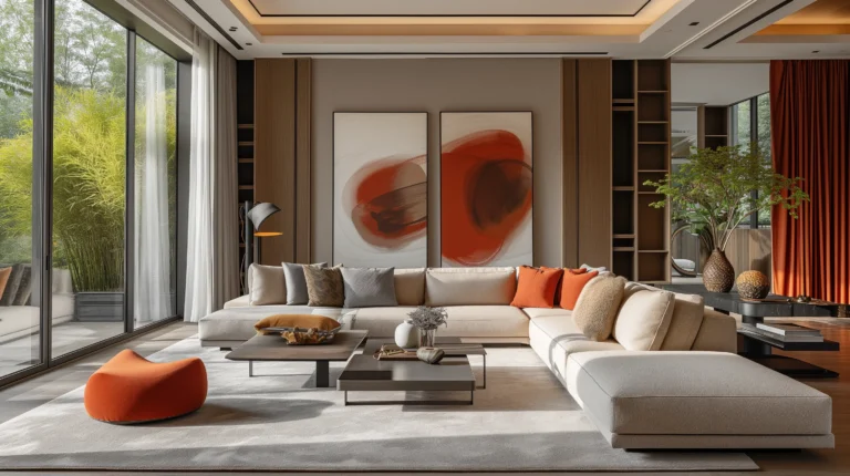

By Inside Decors · Updated January 15, 2026
Affiliate Disclosure: This article contains affiliate links. If you make a purchase through these links, we may earn a small commission at no extra cost to you. We only recommend products we genuinely believe will help you create a beautiful home.
Choosing the right color scheme can make or break a room’s design. Too many competing colors create visual chaos, while too few can feel flat and uninspiring. The 60-30-10 decorating rule solves this problem by providing a proven framework that professional designers have used for decades to create balanced, cohesive spaces.
This comprehensive guide will show you exactly how to apply the 60-30-10 rule in your home, from selecting your three colors to adapting the proportions for different rooms. Whether you’re refreshing a single room or planning a whole-home color scheme, you’ll learn the practical techniques that transform good design into great design.
Key Takeaways
- The 60-30-10 rule divides your color scheme into three parts: 60% dominant color (walls, large furniture), 30% secondary color (upholstery, curtains), and 10% accent color (pillows, artwork, accessories)
- This proportion creates visual balance by preventing any single color from overwhelming the space while maintaining enough variety to keep the room interesting
- Start with your dominant neutral, then choose a secondary color that complements it, and finish with a bold accent that adds personality
- The rule is flexible: You can adjust proportions based on room size, purpose, and your personal style preferences
- Use a color wheel to identify complementary, analogous, or triadic color relationships that work harmoniously together
- Apply the rule room-by-room for best results, adjusting your palette to suit each space’s function and lighting conditions
What Is the 60-30-10 Decorating Rule?

The 60-30-10 rule is a color distribution formula that divides your room’s palette into three distinct proportions: 60% of a dominant color, 30% of a secondary color, and 10% of an accent color. This isn’t just an arbitrary split—it’s based on how the human eye naturally processes visual information and seeks balance.
The dominant color (60%) typically appears on your largest surfaces: walls, area rugs, or substantial furniture pieces like sofas. This color sets the overall mood and serves as your room’s foundation. Most designers recommend choosing a neutral or subdued tone for this portion—think soft grays, warm beiges, or muted blues—because it’s the hardest element to change later.
The secondary color (30%) adds depth and interest without competing with your dominant hue. You’ll see this in upholstery, window treatments, bedding, or secondary furniture pieces. This color should complement your dominant shade while introducing contrast. If your walls are a soft gray, your secondary might be a warm taupe or a deeper charcoal.
The accent color (10%) is where personality shines through. This bold, eye-catching hue appears in throw pillows, artwork, decorative objects, and small furniture pieces. Because it occupies the smallest proportion, you can choose something vibrant—coral, emerald, mustard yellow—without overwhelming the space.
Why This Formula Works
Colors trigger emotional responses and influence how we perceive space. The 60-30-10 rule works because it creates hierarchy and prevents sensory overload. When you walk into a room with equal amounts of multiple colors, your brain struggles to find a focal point. The 60-30-10 split guides the eye naturally, creating a sense of order that feels instinctively “right.”
Research in environmental psychology shows that balanced color schemes reduce stress and improve mood. A room following this rule feels intentional rather than haphazard, professional rather than amateur. The proportions also align with the golden ratio principles that appear throughout nature and classical architecture—patterns our brains are hardwired to find pleasing.
How to Apply the 60-30-10 Rule: Step-by-Step

Step 1: Choose Your Dominant Color (60%)
Start by selecting the color that will cover the majority of your space. Consider these factors:
- Existing fixed elements: If you’re not repainting or replacing flooring, work with what you have
- Room size and light: Lighter dominants make small rooms feel larger; darker tones add coziness to spacious areas
- Desired mood: Cool blues and greens create calm; warm beiges and taupes feel inviting
- Longevity: Choose something you won’t tire of quickly, since this is your largest investment
For most rooms, walls represent the easiest way to achieve your 60%. A gallon of quality paint costs $30-70 and covers approximately 350-400 square feet. If you prefer wallpaper, budget $50-200 per roll (covering about 56 square feet), plus installation costs of $200-500 for an average bedroom.
Real example: In my own living room renovation, I chose Benjamin Moore’s “Classic Gray” (a warm, light greige) for the walls. This neutral dominant allowed flexibility with furniture and accessories while making the 12×14 space feel open and airy.
Step 2: Select Your Secondary Color (30%)
Your secondary color should complement your dominant while adding visual interest. This typically appears in:
- Upholstered furniture (sofas, chairs, ottomans)
- Window treatments (curtains, blinds, shades)
- Bedding and larger textiles
- Secondary wall treatments (accent walls, wainscoting)
Use the color wheel to guide your choice. If your dominant is a cool gray, consider:
– Analogous approach: A soft blue or blue-green (colors adjacent on the wheel)
– Complementary approach: A warm taupe or beige (opposite temperature)
– Monochromatic approach: A medium or dark gray (same color family)
Budget consideration: A quality sofa in your secondary color runs $800-2,500, while custom curtains cost $200-600 per window. If budget is tight, start with slipcovers ($100-300) or ready-made curtains ($40-150 per panel) in your chosen hue.
Step 3: Add Your Accent Color (10%)
This is where you inject personality and create focal points. Your accent appears in:
- Decorative pillows and throws
- Artwork and wall decor
- Lamps and lighting fixtures
- Vases, books, and accessories
- Small furniture pieces (accent chairs, side tables)
Choose something that energizes the space. If your dominant is gray and secondary is navy, consider:
– Warm metallics: Gold or brass accents ($25-150 for decorative objects)
– Jewel tones: Emerald green or sapphire blue pillows ($30-80 each)
– Vibrant hues: Coral, mustard, or teal accessories ($15-100 per item)
Pro tip: Purchase 4-6 accent pillows in your chosen color from retailers like Amazon. Search for “decorative throw pillows” in your specific hue. Mix solid colors with patterns that incorporate all three of your palette colors for cohesion.
Step 4: Test Before Committing
Before making major purchases:
- Get paint samples: Buy 8-ounce tester pots ($3-5 each) and paint 2×2-foot sections on different walls
- Observe in different lighting: Check colors in morning, afternoon, and evening light
- Gather fabric swatches: Request free samples from furniture retailers and hold them against your paint samples
- Create a mood board: Use Pinterest or physical samples to visualize the complete scheme
This testing phase costs $20-50 but can save you thousands in returns and repaints.
Understanding Color Proportions in Practice

The 60-30-10 percentages are guidelines, not rigid rules. Here’s how they translate in a typical 12×14 living room:
60% Dominant (approximately 672 square feet of visual space):
– Four walls at 8 feet high = 416 sq ft
– Large area rug (8×10) = 80 sq ft
– Sofa in dominant color = 176 sq ft of visual presence
30% Secondary (approximately 336 square feet of visual space):
– Two accent chairs = 100 sq ft visual presence
– Window treatments (two windows) = 120 sq ft
– Secondary rug or ottoman = 116 sq ft
10% Accent (approximately 112 square feet of visual space):
– Four throw pillows = 16 sq ft
– Artwork (three pieces) = 30 sq ft
– Table lamps, vases, books, accessories = 66 sq ft
These aren’t exact measurements—you’re estimating visual weight, not calculating precise square footage. A bright red pillow has more visual impact than a pale pink one of the same size, so adjust accordingly.
Adapting Proportions for Different Scenarios
Small rooms (under 100 sq ft): Consider shifting to 70-20-10 to maintain simplicity and prevent overwhelm.
Large, open-concept spaces: You might use 50-30-20 to introduce more variety across distinct zones.
Monochromatic schemes: Adjust to 60-25-15, using different shades and textures of the same color family.
Bold personalities: Try 60-20-20, splitting the smaller portions between two different accent colors for more energy.
Choosing Your Three Colors: A Designer’s Approach
Understanding Color Relationships
The color wheel is your most valuable tool for creating harmonious palettes. Here are the three main approaches:
Complementary colors sit opposite each other on the wheel (blue and orange, red and green, yellow and purple). This creates high contrast and energy—perfect for spaces where you want drama and visual interest. However, use the brighter color as your 10% accent to avoid overwhelming the space.
Analogous colors sit next to each other (blue, blue-green, green). This creates a serene, cohesive look that’s easy on the eyes. It’s ideal for bedrooms and spaces designed for relaxation. The challenge is adding enough contrast, which you can achieve through varying shades and textures.
Triadic colors are evenly spaced around the wheel (red, yellow, blue). This offers vibrant variety while maintaining balance. It’s trickier to execute but creates dynamic, memorable spaces when done well.
Practical Color Selection Process
For beginners: Start with a piece you love—a rug, artwork, or fabric—and pull your three colors from it. This guarantees they’ll work together because someone else (the artist or designer) has already done the hard work.
For the adventurous: Use online tools like Canva’s color wheel or Adobe Color to experiment with combinations. Input your dominant color and let the tool suggest complementary options.
For the budget-conscious: Choose inexpensive items for your accent color (10%) so you can swap it out seasonally or when trends change. Your dominant and secondary colors should be more timeless investments.
Real-World Color Combinations That Work
| Dominant (60%) | Secondary (30%) | Accent (10%) | Best For | Mood Created |
|---|---|---|---|---|
| Soft White | Navy Blue | Coral | Living rooms, bedrooms | Classic, coastal, fresh |
| Warm Gray | Charcoal | Mustard Yellow | Offices, dens | Sophisticated, energizing |
| Beige | Sage Green | Terracotta | Dining rooms, kitchens | Earthy, welcoming |
| Light Blue | White | Gold | Bathrooms, bedrooms | Serene, luxurious |
| Cream | Chocolate Brown | Teal | Living rooms, studies | Warm, grounded, elegant |
| Pale Pink | Gray | Black | Bedrooms, dressing rooms | Modern, feminine, bold |
Each of these combinations has been tested in real client projects with consistently positive results.
Room-by-Room Application Guide
Living Rooms
Living rooms benefit most from the 60-30-10 rule because they typically contain the most furniture and accessories. Here’s a practical breakdown:
Dominant (60%): Wall color plus a large neutral sofa or sectional. If your sofa is patterned, ensure the dominant color in the pattern matches your wall tone. A quality neutral sofa or slipcover runs $800-2,000.
Secondary (30%): Accent chairs, curtains, and a secondary area rug or large ottoman. Window treatments should complement without matching exactly—if walls are light gray, choose curtains in a medium gray or soft blue-gray.
Accent (10%): Throw pillows (4-6 in your accent color), artwork, table lamps, and decorative objects. Mix in metallic accents like brass table lamps or gold picture frames to add dimension.
Real example: Client project in a 15×18 living room: Benjamin Moore “Pale Oak” walls (60%), a charcoal gray sectional and cream curtains (30%), and emerald green pillows with brass accents (10%). Total investment: $4,200 including paint, furniture, and accessories.
Bedrooms
Bedrooms should prioritize calm and cohesion. The 60-30-10 rule helps create a restful environment without monotony.
Dominant (60%): Wall color plus bedding. Choose soft, soothing tones—blues, greens, grays, or warm neutrals. Your duvet or comforter is a large visual element, so if it’s patterned, ensure the background color matches your walls.
Secondary (30%): Upholstered headboard, curtains, area rug, or accent chair. This is where you can introduce a complementary color that adds interest. A tufted headboard in your secondary color costs $150-600 depending on size.
Accent (10%): Decorative pillows, throw blanket, bedside lamps, and artwork. Keep this layer minimal in bedrooms—too many accents can feel stimulating rather than restful.
Pro tip: In bedrooms, consider shifting to 70-20-10 for a more serene feel, especially if you’re sensitive to visual stimulation before sleep.
Kitchens and Dining Rooms
These spaces often have fixed elements (cabinets, countertops, appliances) that you must work around.
Dominant (60%): Cabinet color or wall color, depending on which occupies more visual space. White or cream cabinets are timeless dominants that allow flexibility with other elements.
Secondary (30%): Countertops, backsplash, or dining chairs. If you have white cabinets, a gray or blue-gray backsplash adds sophistication. Dining chairs in your secondary color create cohesion between kitchen and dining areas.
Accent (10%): Bar stools, pendant lights, dishware, and decorative items. This is where you can have fun—colorful pendant lights over an island or vibrant dining chair cushions inject personality without permanent commitment.
Bathrooms
Bathrooms present unique challenges due to fixtures, tile, and moisture considerations. For more guidance on coordinating bathroom elements, see our guide on choosing the right bathroom fittings.
Dominant (60%): Wall color or tile color. Light, neutral dominants make small bathrooms feel larger. If you have existing tile you can’t replace, make that your dominant and choose your other colors to complement it.
Secondary (30%): Vanity color, shower curtain, or window treatment. A painted vanity in your secondary color adds character—navy, sage green, or charcoal are popular choices that hide wear better than white.
Accent (10%): Towels, bath mat, accessories, and artwork. Swap these seasonally to refresh the space inexpensively. A set of luxury bath towels in your accent color costs $40-120.
Breaking the Rule: When and How
The 60-30-10 rule is a guideline, not a law. Here’s when breaking it makes sense—and how to do it successfully.
Monochromatic Schemes
If you want a sophisticated, serene space using variations of a single color, adjust to 60-30-10 using different shades, tints, and tones rather than different hues. For example:
- 60%: Pale blue walls
- 30%: Medium blue upholstery
- 10%: Deep navy accents
This creates depth while maintaining simplicity. Add interest through varied textures—linen, velvet, wool, metal—to prevent flatness.
Bold, Eclectic Spaces
If your interior design style leans toward maximalist or boho, you might use 40-30-20-10, splitting your palette across four colors. This works when:
- You have a strong unifying element (like a patterned rug that contains all four colors)
- You’re an experienced decorator who understands color relationships
- The room has excellent natural light to prevent muddiness
Two-Color Schemes
Sometimes less is more. A 70-30 split using just two colors creates striking, modern spaces:
- 70%: White walls, white sofa, white bedding
- 30%: Black accents, black furniture, black accessories
This high-contrast approach works beautifully in contemporary and Scandinavian designs. For inspiration on using bold contrasts, explore our black interior doors guide.
Maintaining Cohesion When Breaking the Rule
If you deviate from 60-30-10:
- Use a unifying pattern: A rug, artwork, or fabric that contains all your colors ties everything together
- Repeat colors across the room: Each color should appear at least twice to feel intentional
- Vary the intensity: Use different shades of each color to create depth
- Balance warm and cool: Mix warm and cool tones to prevent the space from feeling too stark or too cozy
Advanced Color Theory for Better Results
Understanding Undertones
Every color has an undertone—a subtle hint of another color beneath the surface. This is why two “gray” paints can look completely different in your home. Common undertones include:
- Warm: Yellow, orange, red (makes colors feel cozy and inviting)
- Cool: Blue, green, purple (makes colors feel crisp and refreshing)
- Neutral: Balanced warm and cool (versatile but can read as flat)
Critical tip: Your three colors should have compatible undertones. A warm beige (yellow undertone) clashes with a cool gray (blue undertone), creating an unsettled feeling. Test paint samples next to each other to ensure harmony.
The Role of Neutrals
Neutrals (white, black, gray, beige, brown) are essential for giving the eye places to rest. Even in colorful schemes, neutrals should comprise at least 60% of your palette. They:
- Prevent sensory overload
- Make bold colors appear more vibrant by contrast
- Create a timeless foundation that allows trend-driven accents to shine
Designer secret: “Greige” (gray + beige) has dominated interiors for the past decade because it bridges warm and cool, working with virtually any accent color. Benjamin Moore’s “Revere Pewter” and Sherwin-Williams’ “Agreeable Gray” are industry standards.
Using the 60-30-10 Rule with Patterns
Patterns complicate color distribution, but the rule still applies:
- Identify the dominant color in your pattern (usually the background)—this counts toward your 60%
- The secondary pattern color contributes to your 30%
- Accent colors in the pattern add to your 10%
For example, a navy and white striped rug with coral details contains all three of your colors. This single piece can anchor your entire scheme.
Lighting’s Impact on Color
Colors shift dramatically under different lighting conditions:
- North-facing rooms receive cool, bluish light—warm colors prevent them from feeling cold
- South-facing rooms get warm, golden light—cool colors balance the warmth
- East-facing rooms have warm morning light, cool afternoon light—neutral dominants adapt best
- West-facing rooms have cool morning light, warm afternoon/evening light—test colors at different times
Action step: Paint large samples (at least 2×2 feet) on multiple walls and observe them for 48 hours before committing. A $5 paint sample can save you from a $500 mistake.
Common Mistakes and How to Avoid Them
Mistake 1: Choosing Colors in Isolation
Selecting paint colors, furniture, and accessories separately without considering how they interact leads to disjointed spaces.
Solution: Gather all samples—paint chips, fabric swatches, flooring samples—and view them together in your actual space. Colors that look perfect in a store can clash terribly in your home’s specific lighting.
Mistake 2: Ignoring Existing Fixed Elements
You can’t ignore your oak floors, granite countertops, or brick fireplace. These permanent features must be incorporated into your scheme.
Solution: Make fixed elements part of your 60% or 30%, then choose your remaining colors to complement them. If you have warm oak floors, embrace warm undertones throughout your palette.
Mistake 3: Too Matchy-Matchy
Using the exact same shade for all instances of each color creates a flat, uninspired look.
Solution: Vary the shades within each color category. If your secondary is blue, use navy for curtains, medium blue for an accent chair, and soft blue-gray for a throw blanket. This adds depth while maintaining cohesion.
Mistake 4: Forgetting About Texture
Color is only half the equation—texture adds dimension and interest.
Solution: Even in monochromatic schemes, mix smooth (glass, metal, silk) with rough (linen, jute, wood) textures. A room with varied textures feels rich and layered; one without feels flat regardless of color choices.
Mistake 5: Neglecting the Ceiling and Trim
Many people focus solely on walls and furniture, forgetting that ceilings and trim occupy significant visual space.
Solution: White or off-white ceilings and trim are safe defaults that don’t disrupt your 60-30-10 balance. If you paint them a color, factor that into your percentages—a dark ceiling counts toward your dominant or secondary color.
Budget-Friendly Implementation Strategies
You don’t need to redecorate entirely to apply the 60-30-10 rule. Here’s how to work with what you have:
Start with Accessories (Under $500)
If your walls and major furniture are neutral:
- Identify your existing dominant and secondary colors (probably neutrals)
- Choose a bold accent color and purchase 4-6 throw pillows ($120-240), a throw blanket ($40-80), artwork ($50-150), and decorative objects ($50-100)
- Total investment: $260-570 for a completely refreshed look
Add Secondary Color Through Textiles ($500-1,500)
If you’re ready for more impact:
- Purchase curtains in your secondary color ($200-600 for an average room)
- Add an area rug that incorporates all three colors ($200-800 depending on size)
- Include accent pillows and accessories ($100-300)
- Total investment: $500-1,700
Full Room Refresh ($2,000-5,000)
For a complete transformation:
- Paint walls in your dominant color ($200-500 including supplies and labor if needed)
- Purchase or reupholster a major furniture piece in your secondary color ($800-2,500)
- Add curtains, rug, and lighting ($500-1,200)
- Layer in accent accessories ($200-500)
- Total investment: $1,700-4,700
Money-Saving Tips
- Shop end-of-season sales for pillows, throws, and decor (50-70% off)
- Use slipcovers to change furniture color without buying new pieces ($100-400 vs. $1,000+ for new furniture)
- DIY artwork in your accent color using canvas and acrylic paint ($30-60 for supplies)
- Repaint existing furniture instead of buying new—a quart of furniture paint costs $15-30
- Start with one room and perfect your technique before tackling the whole house
For more budget-conscious decorating strategies, see our guide on making your home look expensive on a budget.
Seasonal Color Swaps Using the 60-30-10 Framework
One advantage of the 60-30-10 rule is that you can refresh your space seasonally by swapping only the 10% accent layer.
Spring/Summer Accents
Keep your 60% and 30% neutral year-round, then introduce:
- Coral, turquoise, or sunny yellow accents
- Lightweight linen or cotton throw pillows
- Fresh flowers in accent color vases
- Bright artwork or photography
Investment: $150-300 for seasonal pillows, throws, and accessories
Fall/Winter Accents
Swap to warmer, richer accent colors:
- Burgundy, forest green, or burnt orange accents
- Velvet or wool throw pillows and blankets
- Metallic gold or copper accessories
- Deeper, moodier artwork
Investment: $150-300 for seasonal rotation
Store off-season accents in labeled bins to protect your investment and make swapping effortless. This approach keeps your home feeling fresh without the expense of constant redecorating.
Shop This Look
Editor-picked finds to bring this style home:
- Velvet Accent Chair →Adds a luxurious pop of color as the 10% accent.
- Neutral Sectional Sofa →Forms the foundational 60% base of the room’s color palette.
- Patterned Area Rug →Introduces the 30% secondary color and adds visual interest.
- Ceramic Table Lamps →Provides ambient lighting and subtle texture as part of the 10%.
As an Amazon Associate we earn from qualifying purchases.
Frequently Asked Questions
What if I have a patterned sofa or rug—how do I apply the 60-30-10 rule?
Identify the three most prominent colors in your pattern and use those as your 60-30-10 palette. The background color of the pattern typically becomes your dominant (60%), the secondary pattern color is your 30%, and any accent colors in the pattern represent your 10%. Pull solid-colored accessories and textiles in these exact shades to create cohesion. If your patterned piece contains more than three colors, choose the three that appear most frequently and ignore minor accent colors.
Can I use the 60-30-10 rule in an open-concept space with multiple rooms visible from one area?
Yes, but you’ll need to adapt your approach. Choose one cohesive 60-30-10 palette for the entire open area, then vary how you apply it in each zone. For example, your living area might have the dominant color on walls with secondary on the sofa, while your dining area has the dominant on walls with secondary on dining chairs. The key is maintaining the same three colors throughout so the eye travels smoothly across the space. You can introduce a fourth accent color in a private room that’s not visible from the main area.
How do I choose between warm and cool colors for my dominant shade?
Consider your room’s natural light and your personal temperature preference. North-facing rooms with cool, bluish light benefit from warm dominants (beiges, warm grays, soft yellows) to counteract the coldness. South-facing rooms with abundant warm light can handle cool dominants (blues, greens, cool grays) without feeling stark. Also consider climate—if you live somewhere hot, cool colors psychologically reduce perceived temperature, while warm colors make cold climates feel cozier. Test large paint samples in your actual space for 48 hours before deciding.
Is it okay to use black or white as one of my three colors?
Black and white function as neutrals that don’t typically count toward your three colors—they’re supporting players that add contrast and definition. Most successful 60-30-10 schemes include white (trim, ceilings, some accessories) and often black (window frames, hardware, small accents) in addition to the three main colors. However, if you’re creating a high-contrast scheme where black or white is a dominant visual element (like a black accent wall or white furniture), then count it as one of your three colors.
How long should I expect a 60-30-10 color scheme to last before it feels dated?
If you choose your 60% and 30% from classic, timeless colors (neutrals, soft blues, greens, or earth tones), your scheme should feel current for 7-10 years. Reserve trendy colors for your 10% accent layer, which you can swap inexpensively every 2-3 years as trends evolve. For example, a scheme with gray walls (60%), navy sofa (30%), and coral accents (10%) has a timeless foundation—when coral feels dated, swap to emerald or mustard accents for $200-300 rather than repainting and buying new furniture.
What’s the biggest mistake people make when applying the 60-30-10 rule?
The most common mistake is choosing all three colors at the same intensity level, which creates competition rather than harmony. Your dominant (60%) should be the most subdued—a soft, neutral tone. Your secondary (30%) can have more saturation but should still be relatively calm. Only your accent (10%) should be bold and vibrant. For example, pairing bright yellow walls (60%) with bright blue furniture (30%) and bright red accents (10%) creates visual chaos. Instead, try soft cream walls (60%), medium blue furniture (30%), and vibrant red accents (10%) for a balanced, sophisticated look.
Creating a Cohesive Whole-Home Color Story
While you can apply the 60-30-10 rule room by room, creating a whole-home color strategy ensures your space feels intentionally designed rather than haphazard.
Establishing a Primary Palette
Choose a “home palette” of 4-5 colors that appear throughout your house in varying proportions:
- 2 neutrals (one warm, one cool) for flexibility
- 1 main color that reflects your personality
- 2 accent colors that complement your main color
For example: warm white, cool gray, navy, coral, and gold. Every room uses some combination of these five colors in 60-30-10 proportions.
Room-to-Room Variation
Each room can emphasize different colors from your home palette:
- Living room: Gray walls (60%), navy sofa (30%), coral and gold accents (10%)
- Bedroom: Warm white walls (60%), gray bedding (30%), navy and gold accents (10%)
- Bathroom: Warm white walls and vanity (60%), navy shower curtain (30%), coral and gold accents (10%)
This approach creates variety while maintaining cohesion. When you can see from one room into another, the repeated colors create visual flow.
Transition Spaces
Hallways, entryways, and staircases should use your most neutral tones (usually your 60% dominant) to serve as palate cleansers between rooms. This allows each room to have its own personality while the transitions keep the home feeling unified.
For comprehensive guidance on creating a cohesive design throughout your home, explore our article on the 7 principles of interior design.
Final Thoughts: Making the Rule Work for You
The 60-30-10 decorating rule isn’t about rigid adherence to percentages—it’s about understanding the principle of balanced color distribution and adapting it to your unique space, style, and budget.
Start small. Choose one room, select your three colors using the guidance in this article, and experiment with the proportions. Take photos as you go so you can see what works and what doesn’t. Most importantly, trust your instincts. If a room feels off, it probably is—adjust your proportions, swap a color, or try a different approach.
Remember that creating a beautiful home is a process, not a one-time event. Your color preferences will evolve, trends will change, and your life circumstances will shift. The 60-30-10 rule gives you a flexible framework that grows with you, allowing you to refresh your space affordably by swapping accent colors or more dramatically by changing your secondary color.
The most successful interiors aren’t those that follow rules perfectly—they’re the ones that feel authentically you. Use the 60-30-10 rule as your foundation, then layer in your personality, experiences, and the things you love. That’s when a house truly becomes a home.
Ready to start your color transformation? Begin by identifying your dominant color, then build your palette from there. Your beautifully balanced space is just three colors away.
About Inside Decors
At Inside Decors, we’re proud to have a talented team of interior designers who are experts in bringing spaces to life. With years of experience and a passion for creating beautiful, functional interiors, they’re the go-to experts in the industry. Our designers are true professionals, committed to delivering the best content and staying ahead of the curve with their certifications and continuous learning. When you read our guides, you’re in good hands.